#MakeoverMonday | Week 52 | 2019: Estimated Christmas spending by concept
My last dataset for this year falls into Christmas week, so after a little convincing from Andy I set aside the data I had originally planned to use and picked a simple Christmas spending dataset from the Deloitte Christmas Survey 2019.
Here is the original viz:

What works well:
- The table is simple and easy enough to read
- Most people are likely familiar with these types of tables and can understand the information presented without too much effort
- The highlight call-out on the side is interesting
- The arrows show whether spending increased year over year for a category
What could be improved:
- I couldn't find a reference anywhere as to what 'rest of Europe' includes. There is a note that currency was converted from EUR to GBP, so does that mean rest of Europe is only Euro-countries? What about Sweden and Switzerland, Denmark and Poland? Surely they are part of "Europe"? I think this is a significant oversight and a definition should definitely be included.
- There is unnecessary color used for row dividers, shading, arrows and titles. Yes, I understand they are part of the corporate branding, but they are not necessary and I find them distracting.
- The table makes it difficult to compare UK vs Europe. The numbers in each cell are fairly small and relatable, so readers are likely to just compare them as they read across, each region for year over year comparisons, but that's not easy to do going between tables.
- The 'highlight' section on the side says that spending has increased significantly and while yes, a 21.6% increase per person in the UK, is significant, let's keep things in perspective. It's an increase of £11 per person, which is less than a round-trip commute costs me to get to work.
What I did:
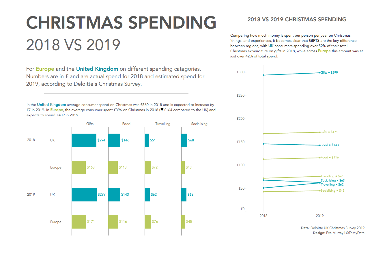
- I created a dashboard that allows viewers to compare spending across categories as well as across years for both regions.
- I chose to display the £ amount as labels as I consider them relevant because they should be relatable for viewers.
- Two distinct colors for the regions are used to differentiate them clearly and because Christmas to me isn't a monochrome topic.
- The bar chart shows just how different the spending patterns are for gifts, while the slope chart makes it clear that traveling is the only category where Europeans spend more than Brits.
- Click for the interactive version.
