#MakeoverMonday | Week 53 |2019
So it has arrived, Andy’s last week as co-host of #MakeoverMonday. After 4 years of running this project (first with Andy Cotgreave, then with me), he is handing over the baton to Charlie to focus on other life projects.
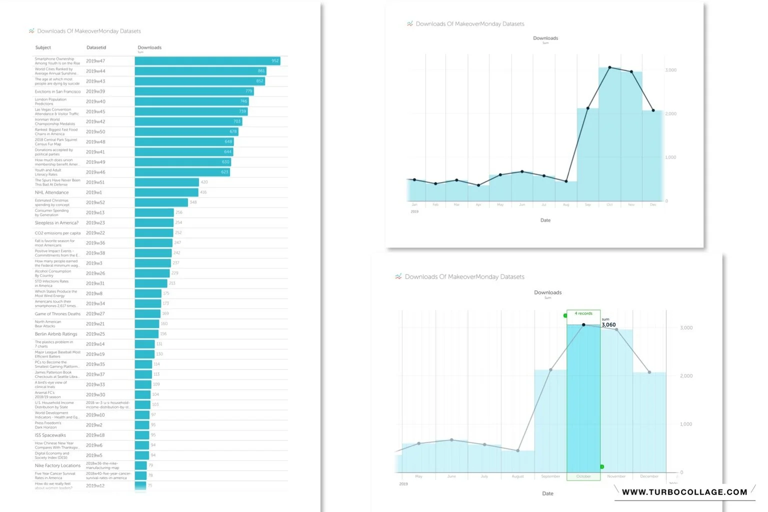
For his last dataset choice, Andy selected data about the #MakeoverMonday project itself, looking at the number of downloads we had from the data.world page.
Here is the original viz Andy built in Google Data Studio:

What works well:
- A simple bar chart showing the popularity of MM subjects in descending order.
- Users can filter the year.
- A clear zero line.
- Neat labels that are easy to read.
What could be improved:
- There is no indication of what the numbers actually mean (they are number of downloads) so it’s difficult to assess what they have to do with popularity.
- The color is unnecessary.
- I don’t get a sense of the change over time.
- For me as a project co-leader, it would be interesting to see when these datasets were published and how ‘seasonality’ with school holidays and public holidays may impact download numbers.
What I did:
- It feels somewhat ironic that I cannot use Tableau for the last dataset of the year, but I am about 600mi away from home where my computer and laptop are that have Tableau installed. I decided to really switch off over the break and have instead installed Vizable on my iPad and have built a viz using the app.
- This means I need to keep things pretty simple, but that’s fine by me, because I like simple and I like spending time away from the screen and with my family instead.
- So here is what I built...


I love how interactive Vizable feels and how it makes me experiment without getting lost in formatting and other details. Yes, I cannot go as deep into analysis as I can in Tableau, but for visualizing data quickly, it certainly does the trick.
