#MakeoverMonday | Week 51 | 2019: NBA Defensive Ratings
For this week, Andy chose a Basketball dataset. My expertise on that topic is limited to the claim of coming from the same town as the 6-time German champion team Brose Baskets. I went to see one of their games and all I remember is that it was really loud and fast :-).
Anyhow, onto this week's dataset and viz. This viz comes from FiveThirtyEight and looks like this:
What works well:
- Nice clean bar chart with clear color choices and great annotations.
- The title intrigues me to find out more.
- The subtitle offers a helpful explanation of the chart's focus.
- The data source is clearly stated.
- Reference lines and reference band use is effective.
- I really like this.
What could be improved:
- I don't understand why 'worse' is at the top and 'better' is at the bottom. I get that it's because of the score, but it doesn't seem intuitive to me.
- The viz makes me wonder 'what happened' because there is a clear change in the quality or effectiveness of their defense but given the reference to Popovich and Duncan I am not sure what their influence has been? I couldn't figure it out from the article either.
- Given that a number of data points are annotated, it would be helpful to have some commentary on the most recent seasons where things got worse.
What I did:
- I read the article line by line, because US Basketball isn't exactly something I am an expert in.
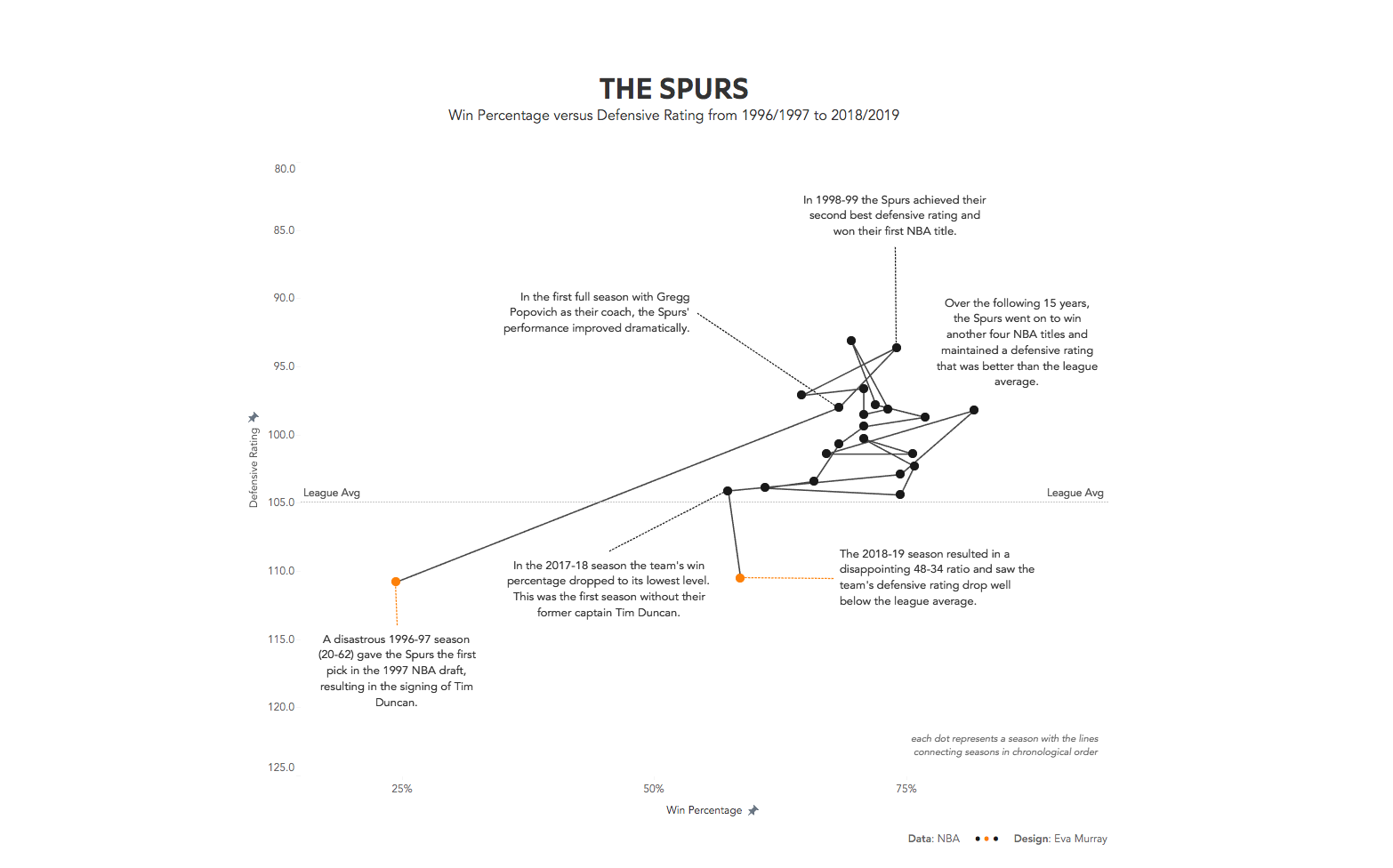
- After spending about 5min with the data, I thought about highlighting the change within the Spurs' result over time by using a slope chart, but ran out of time during the day.
- Getting back to the viz later on and with a suggestion from Andy to look at win percentage versus defensive rating, I looked at those measures, built a connected scatterplot, added annotations and called it a day.
- Here is my viz. To explore the interactive version, click on the image:
