#MakeoverMonday 2020 Week 39 - #Viz5: Child Marriage

Yes, it's time to tackle another #Viz5 topic and this time, much like previously, it's another punchy theme. We're analyzing child marriage and the percentages of underaged girls and boys being married to adults.
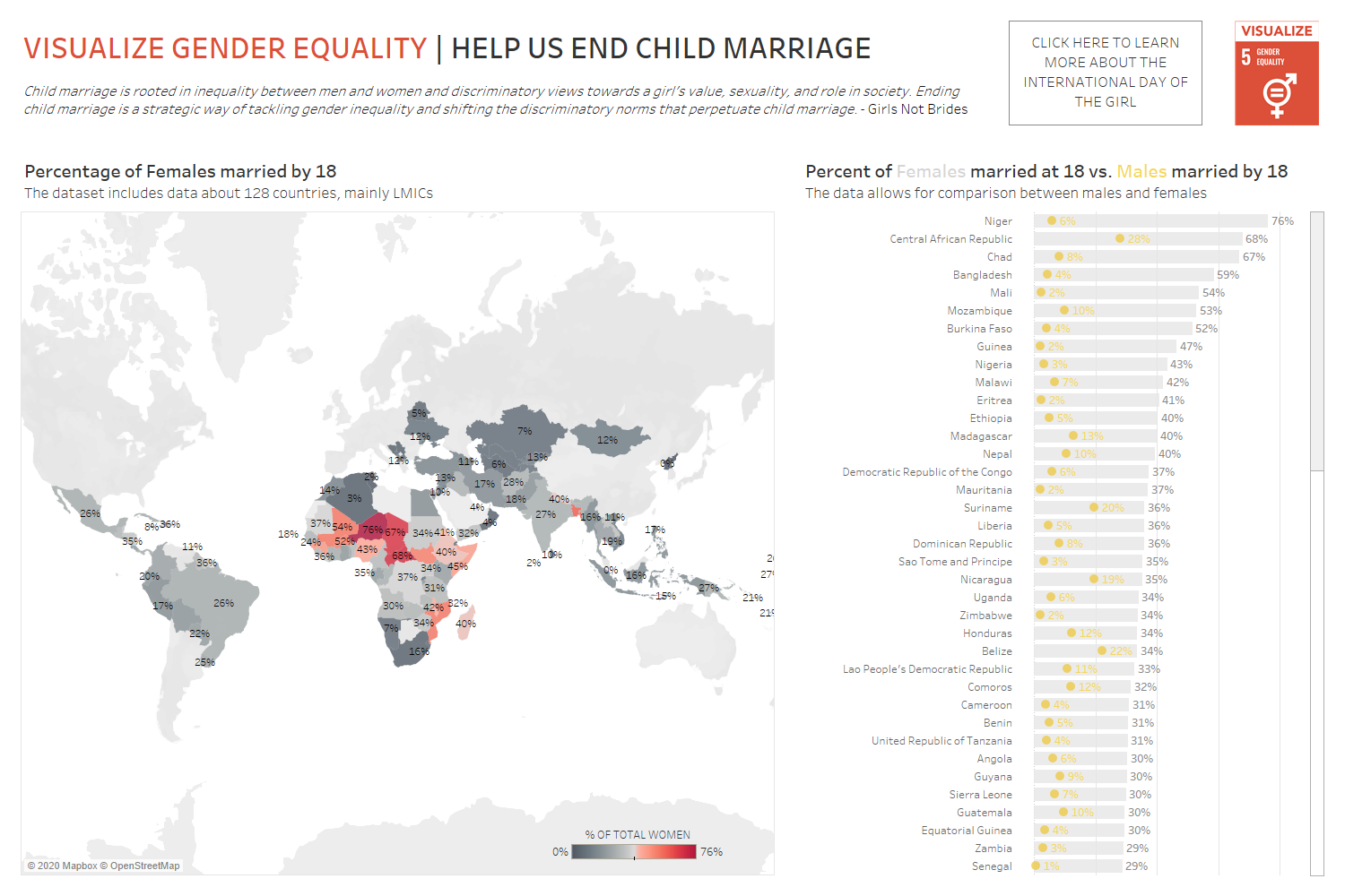
The data for this week's #VisualizeGenderEquality challenge comes from Unicef and the dashboard was created by the team at Operation Fistula to provide us with a starting point.
What works well?
- The title is clear, concise and even contains a call to action (not that easy to do!)
- There is an additional call to action box right next to the Viz5 logo
- The map has a good title and subtitle
- The bar chart on the right allows people to compare between females and males
What could be improved?
- The map isn't particularly useful because small countries are hard to see, labels are hard to read (and to associate with some countries) and the grey color suggests the problem isn't bad when all of the countries have some level of child marriage.
- The bar chart colors are difficult to work with - the yellow is to bright on the light grey background.
- The bar chart also has a long scroll bar because the list of countries is very long.
- A lot of data is being shown but I'm missing some proper insights or points that I can takeaway from this dashboard
What I did:
- My work on #Viz5 vizzes always starts with research because for these topics it is really important to understand the context.
- I also am doing this after Viz Review (check out the recording here) so I have the benefit of an hour long discussion with Seth, looking at multiple vizzes along the way.
- During Viz Review it stood out to me that the worst data point is the fact that almost 30% of girls in Chad are married by the age of 15. I wanted to focus on that data point. But without making it just one big number.
- I did my analysis in Tableau, looking at the 'under 15 years' age group and ranking the countries, then I worked in canva on the design of an infographic. This would be far more fiddly in Tableau so I decided to combine both tools.
- Here is my final version:
- (please us pdf for links to work)
