Makeover Monday | Week 2 |2019: How free is the Press?
For this week's Makeover Monday I chose a dataset about freedom of the press because this has been such an important topic across the world in the past few years.
A big thanks to Andy for helping me get the data in the right shape. I was wrecking my brain over how to do it and with some Alteryx magic he made it happen.
The original viz and data comes from freedomhouse.org and there is an extensive article covering various aspects of the question 'how free is the press?'.
What works well:
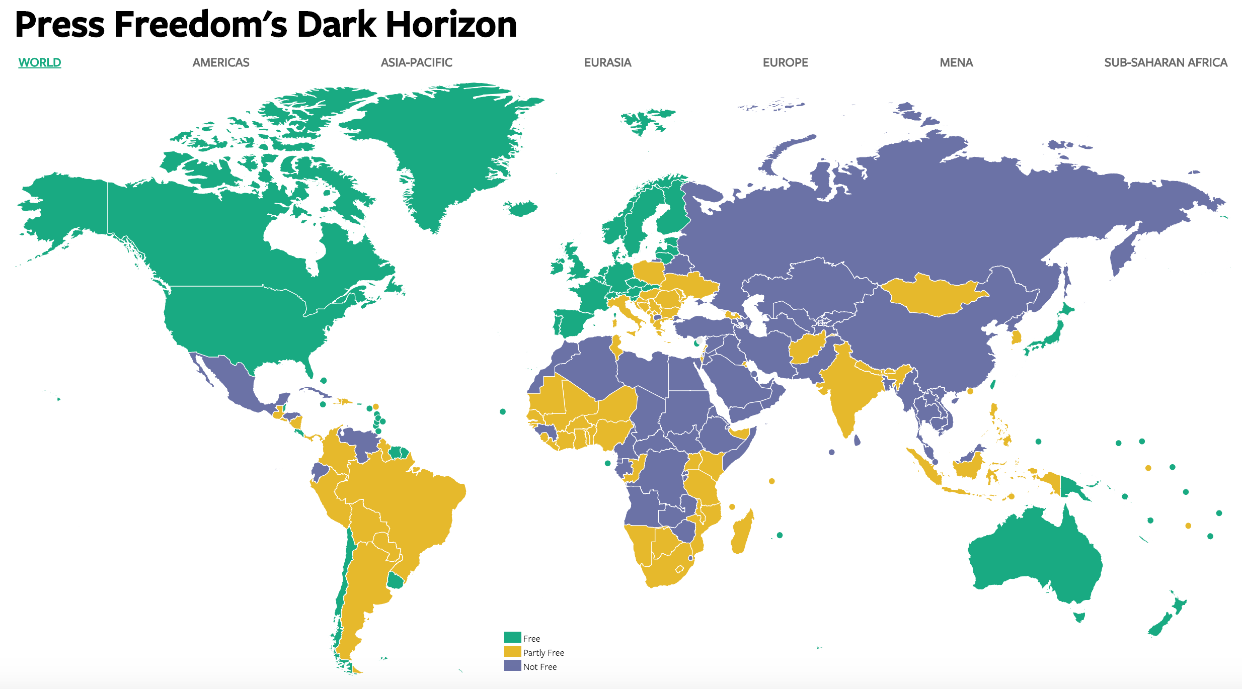
- An interactive map will encourage viewers to engage with the data, investigate different countries' scores and see at a glance which regions of the world are free vs partially free or not free
- The colors are easy to distinguish from one another
- Small islands are indicated by smallish but visible coloured circles
- Clicking on a region at the top allows viewers to zoom-in
- Clicking on a country reveals more detailed information
What could be improved:
- The map gives us a snapshot view of where things are at right now, but doesn't allow for comparisons over time, e.g. are things getting better or worse?
- The detailed country information could be displayed on the same page rather than taking me away to another page
- It would be great to have the definitions of 'free', 'partially free' and 'not free' listed close to the map so viewers have the necessary context
My focus for this week:
- Add contextual information by showing a change over time
- Avoid a line chart with all years and all countries as it can easily look messy
- Add labels for the 3 countries that improved the most and those that saw the worst decline in freedom of the press
- Neat tooltips
