Makeover Monday | Week 1 | 2019: NHL Attendance
And here we go again. Week 1 once more, now my third 'week 1' as a co-host of #MakeoverMonday.
I'm very excited about the year ahead, finding new datasets and dataviz challenges for our community.
Andy picked a dataset about NHL attendance, i.e. how many people go to different NHL games.
Here's the original viz:
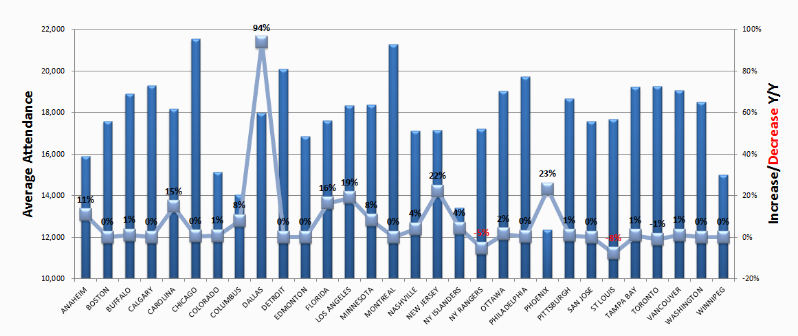
What works well:
- Teams are sorted in alphabetical order.
- Gridlines provide reference points.
- Using black and red for increase and decrease.
What could be improved:
- The axis is cut off which is a big No-No for bar charts, where length matters and helps us to compare. For example, Columbus looks to have half the attendance of Dallas - going by bar length - but it's only a difference of 14,000 to 18,000 attendees, so Dallas has 28.6% more, not twice as much (100% more).
- The labels are almost impossible to read.
- The combination of black font on blue bars is not a good idea.
- The bars seem to have a gradient from dark blue to light blue - why?
- The 3D effect is not just unnecessary, it also makes it more difficult to understand the viz. It takes a second or third look to see where the centres of the little light blue squares are or the ends of the darker blue bars.
- Why are the data points for the percentages (i.e. the light blue squares) connected with a line? This makes no sense as the data is categorical. The slope from Anaheim to Boston has no meaning whatsoever and shouldn't be there. The percentages should only be represented as a line if they're continuous data, like years for example.
My focus for this week:
- In the interest of holidays, celebrating New Years and keeping things simple, my goal this week is to create a viz that is clean looking, easy to understand and communicates my key message.
- I also want to focus on choosing suitable colors.
- Learning something about NHL games, stadiums, attendance, etc. would also not be a bad thing :-)

Thanks Andy for mentioning 'there was a strike' and for helping me understand attendance numbers.