Makeover Monday week 41, 2018: Five Year Cancer Survival Rates in America

Two weeks until we all (hopefully) meet in New Orleans at TC18.Time to sharpen up our dataviz act. This week we're looking at Cancer Survival Rates. Seems like a sad topic at first, but it's about survival, not death, so hopefully things are moving in the right direction.The original viz comes from Our World in Data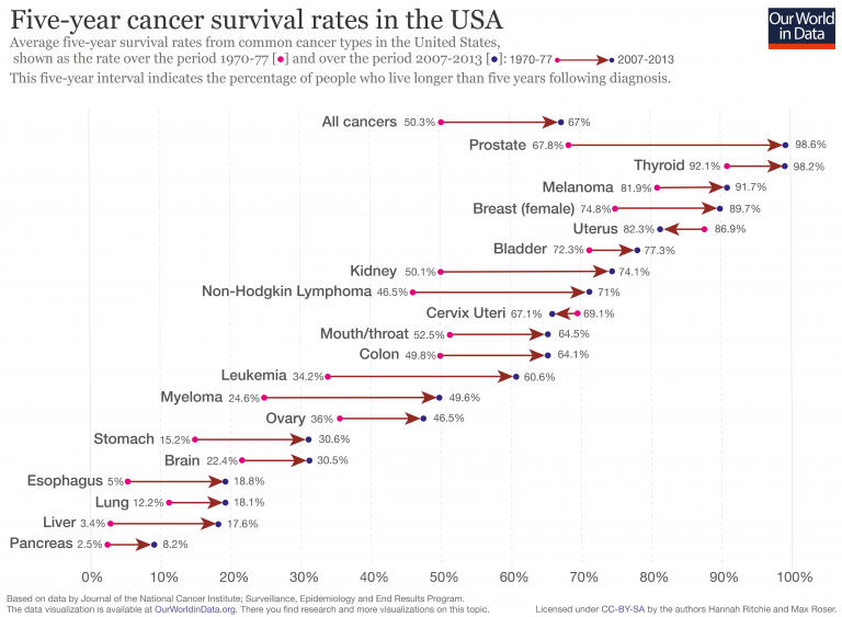
What works well:
- The directional arrows indicate whether progress has been made, i.e. survival rates are higher now than they were in the past. The general trend that's visible is that things are improving as most arrows point to the right
- Including 'All cancers' gives an indication of the overall trend
- The labelling with the cancer type helps because many people are familiar with the different terms. The small number laels are also great for making things clearer
- The subtitle description is really helpful for context and to better understand the visualisation
What could be improved:
- The viz looks very busy and there isn't much space between the different cancer types, so it is quite crowded
- The colors pink, dark blue (purple? black?) and brown for the arrows are a bit odd in combination. The arrow already shows whether it's an increase or a decrease, so coloring the points as well isn't necessary
What I did:
- To me, pancreatic cancer stood out. It has the absolute lowest survival rates of them all and while they improved over time, they're still very very low.
- There is also a difference in survival rates between men and women and between black and white people
- I opted for a waffle chart (Thanks Andy for the tutorial) because it shows so clearly how few people survive beyond 5 years post diagnosis with pancreatic cancer
Click for the interactive version