Makeover Monday week 25, 2018: U.S. Influenza Surveillance Report

We are almost halfway through the year and I have no idea where the time has gone so quickly. Wasn't it just March not long ago???I've been enjoying an extended stay in Berlin for the past week and a bit and will be travelling home today (Sunday) to get back into normal life with work, being at home, eating normal food and cycling on roads that don't have 4 lanes in one direction.I will miss the flat, beautiful countryside west of Berlin but am looking forward to my familiar routine :-).For this week's Makeover Monday, Andy picked a dataset about influenza cases in the US which comes with this line chart.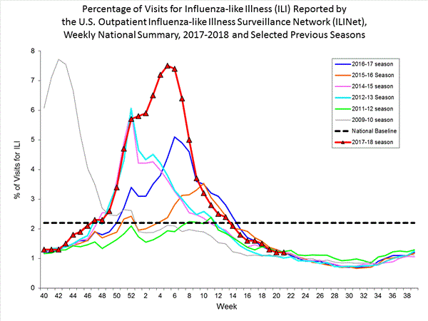
What works well:
- The line chart shows clearly that there is a seasonality to influenza cases
- Axis labels are helpful
- The title provides an explanation of the data
- The most recent season is highlighted with week markers for those weeks that have already passed
- The national baseline provides a helpful reference point to see the ups and downs of influenza cases being reported
What could be improved:
- The color choices are poor. Not only do the colors not work well together, the bright green and blue are difficult to distinguish
- The markers for the 2017-18 season make the viz look messy and are not necessary
- The reference line for the national baseline is too heavy, it should blend more into the background
- A strong title followed by a description (the current header) would make this more impactful
- A reference to months or seasons along the x-axis could help understand which part of the year the weeks fall into. While the weeks are self-explanatory, grouping them visually into seasons would help to also clarify why the x-axis doesn't start at week 1
What I did:
- Again this week I had to experiment a lot until I found something I liked. I even downloaded Andy's workbook (thanks for your help and suggestions :-) ) to take a sneaky look at some calculations
- I spent far longer on this than planned and hereby present you with the viz, showing the 2009-10 season as an outlier
