by Eva Murray | Apr 9, 2019 | Makeover Monday, Tableau
For this week’s Makeover, Andy picked a dataset that looks at the fiscal health of all 50 US states. The original visualization looks like this: What works well: The colors are well-chosen, take into consideration color vision impairments and work well together...

by Eva Murray | Jul 9, 2018 | Tableau
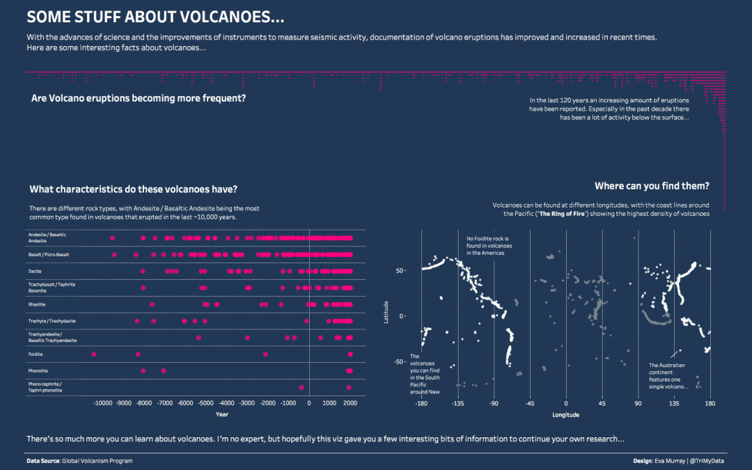
After an exciting week in London last week with #TC18Europe and a Data School project, as well as additional meetings on Monday and Friday, and a training session with our friends from Mapbox, I decided on a dataset for Makeover Monday that contains lots of geospatial...


