by Eva Murray | Mar 19, 2020 | Tableau
It’s been a crazy last few days and there is no point avoiding to talk about it. I would not be honest if I sais #MakeoverMonday is high on my priority list right now. As we all figure out the new situation around the world, working from home, taking care of...
by Eva Murray | Mar 10, 2020 | Makeover Monday, Tableau
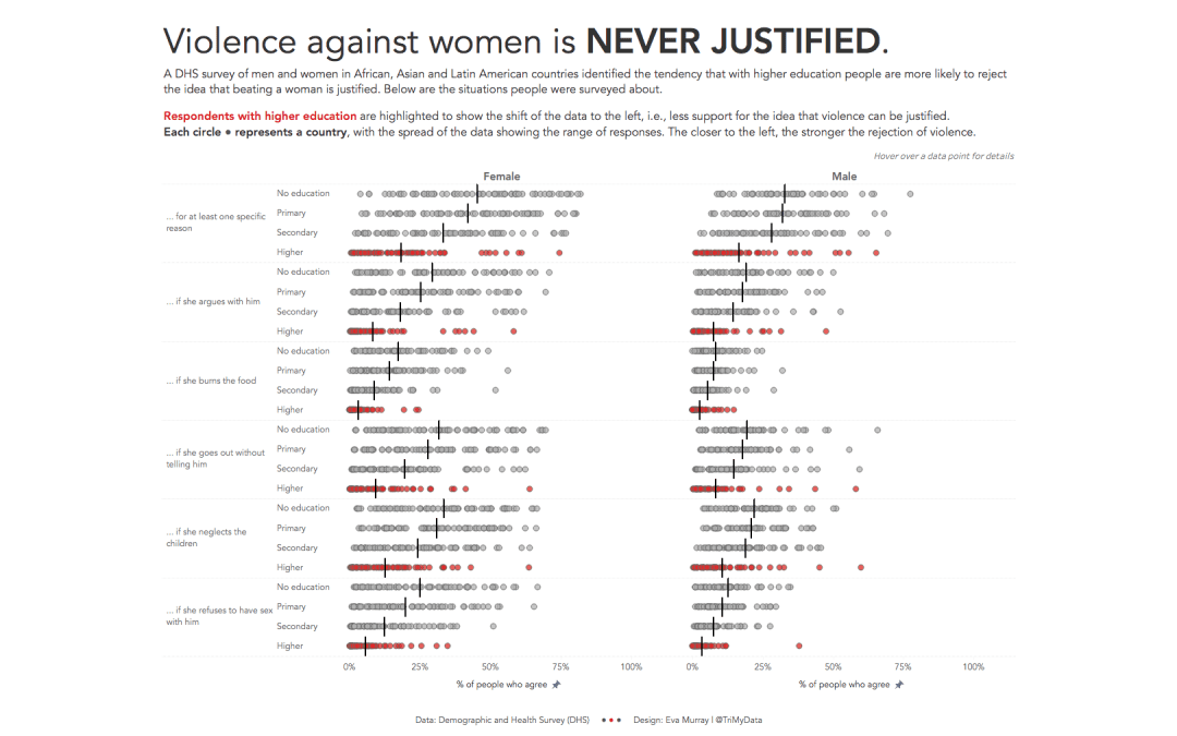
This week we launched the Visualize Gender Equality campaign #Viz5 and we are starting with a heavy topic: violence against women and girls and the perception of women and men towards violence being justified. I am excited about the year-long collaboration with...
by Eva Murray | Mar 3, 2020 | Tableau
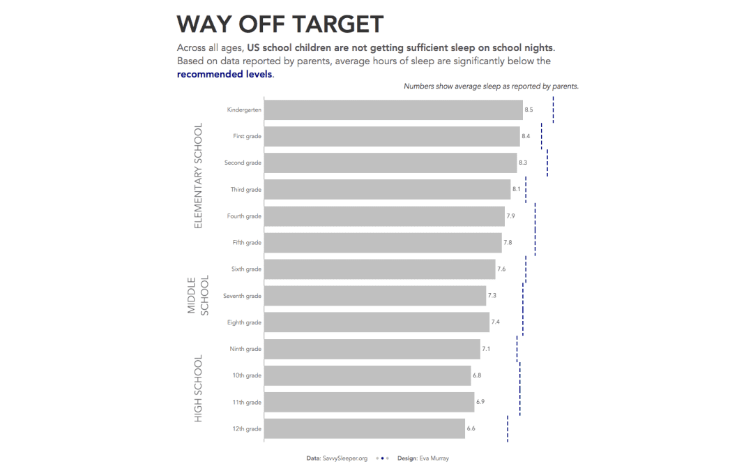
On a Monday morning here in London, the topic of sleep seems pretty appropriate, I have to admit, because getting enough sleep between various work and life commitments (and choices) can be a struggle. Charlie chose the following viz for this week’s...
by Eva Murray | Feb 24, 2020 | Makeover Monday, Tableau
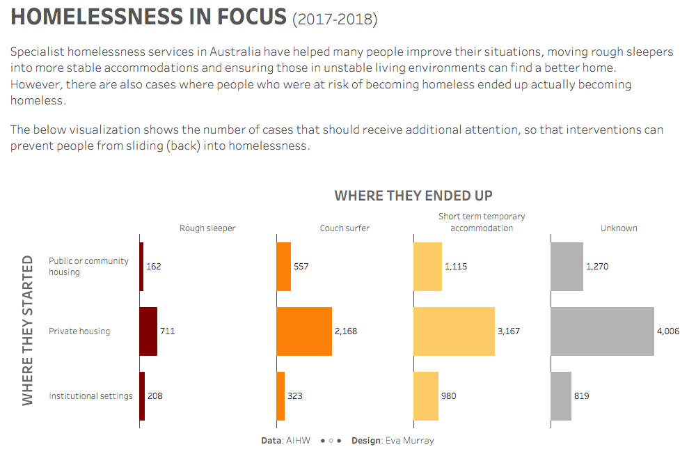
For week 8 I chose a dataset from the Australian Institute of Health and Welfare, looking at homelessness statistics and, more particularly, the outcomes of specialist homelessness services. The original visualization was published on AIHW’s website:...
by Eva Murray | Feb 18, 2020 | Tableau
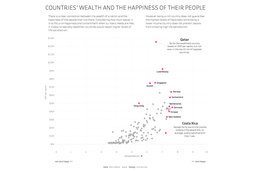
For this week’s #MakeoverMonday challenge, Charlie chose a terrible chart that is in desperate need of a makeover. When I say terrible, it isn’t ugly, it just does a very bad job at communicating data. Here it is:...
by Eva Murray | Feb 11, 2020 | Makeover Monday, Tableau
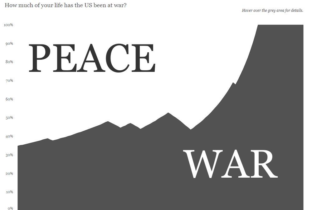
A few weeks ago, someone shared a viz from the Washington Post with me that showed how much of ‘your’ life the US has been at war, depending on someone’s year of birth. I thought this was a fascinating way to look at the data, so decided to challenge...