by Eva Murray | Oct 20, 2020 | Makeover Monday, Tableau
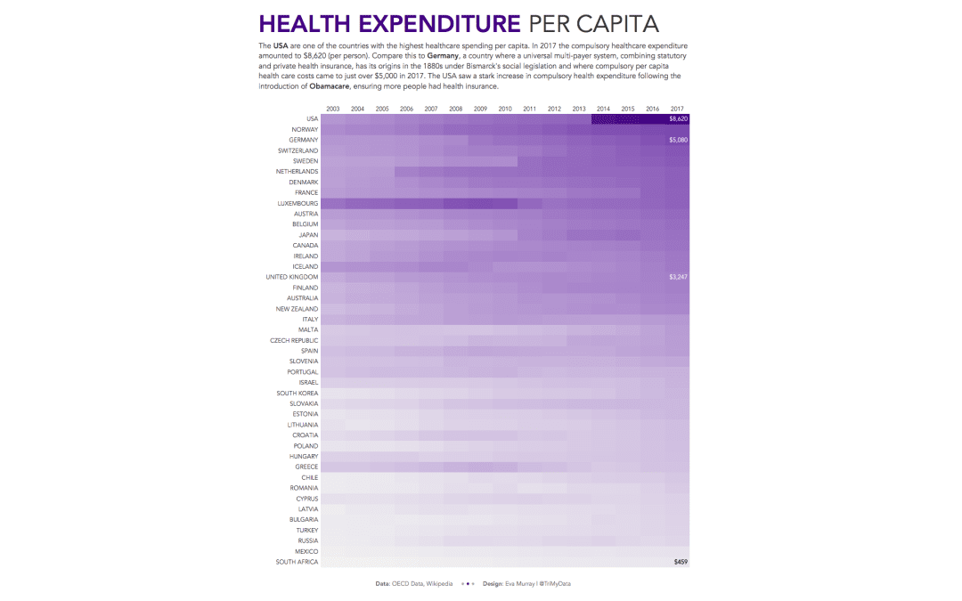
A quick viz this week and a quick blog, looking at health spending per capita in different countries. I’ll admit, I wanted to do a heat map before even looking at the data, so a heat map it is. This week we’re looking at OECD data about healthcare...
by Eva Murray | Oct 12, 2020 | Makeover Monday, Tableau
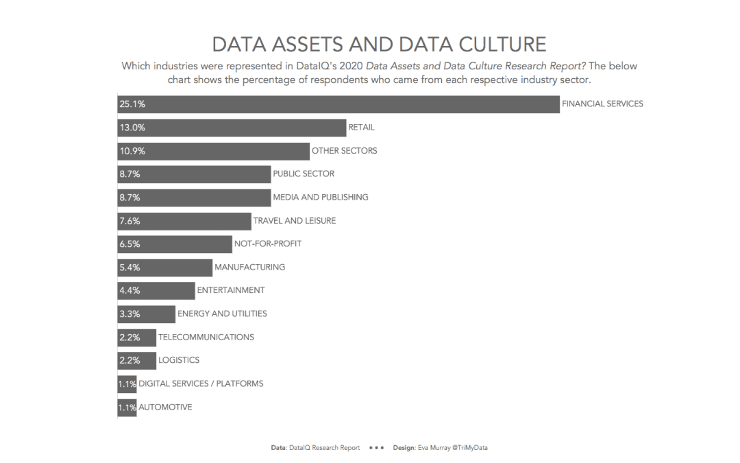
For week 41, Charlie found a whopper of a chart that is in such desperate need of a makeover. After last week’s excitement around #data20, this week should see us all relax a little and go back to business. So here is this week’s visualization from DataIQ,...
by Eva Murray | Oct 5, 2020 | Makeover Monday, Tableau
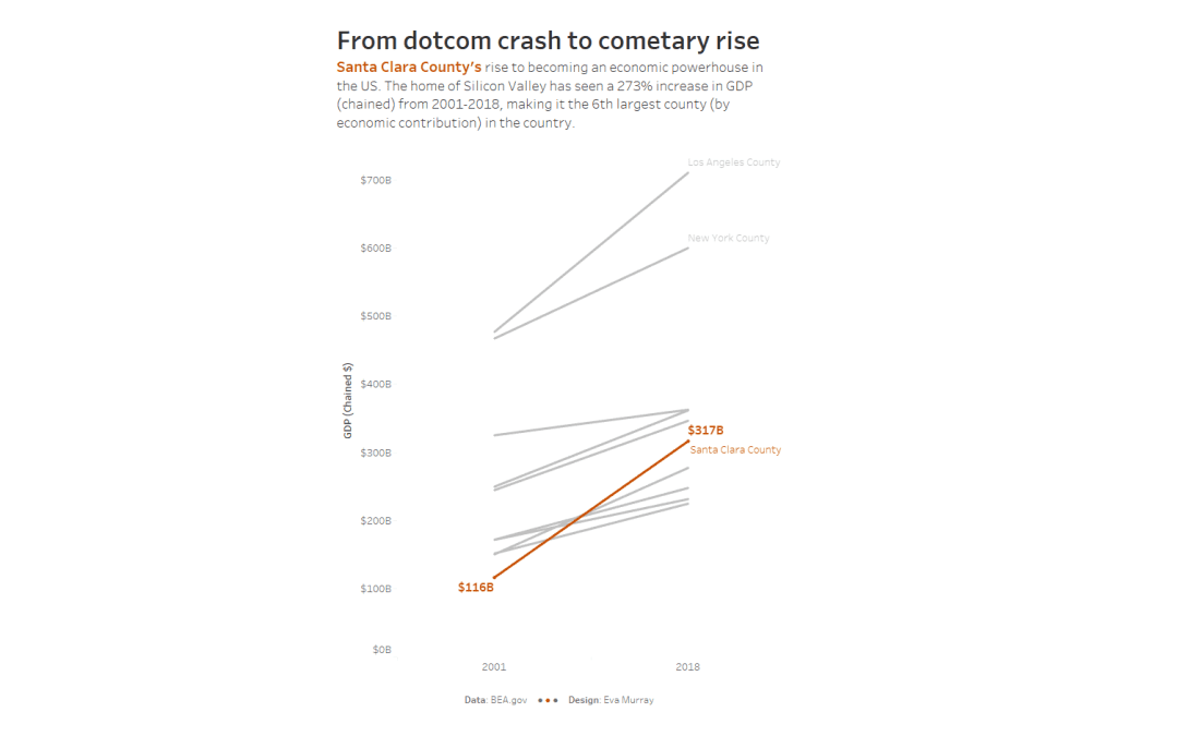
This week it’s time for #data20, Tableau’s virtual conference and to get everyone’s engine warmed up, we’re hosting live Makeover Monday events (Morning and Afternoon session) because we do every Monday before conference. They’re just...
by Eva Murray | Oct 1, 2020 | Tableau
Yes, it’s time to tackle another #Viz5 topic and this time, much like previously, it’s another punchy theme. We’re analyzing child marriage and the percentages of underaged girls and boys being married to adults. The data for this week’s...
by Eva Murray | Sep 22, 2020 | Tableau
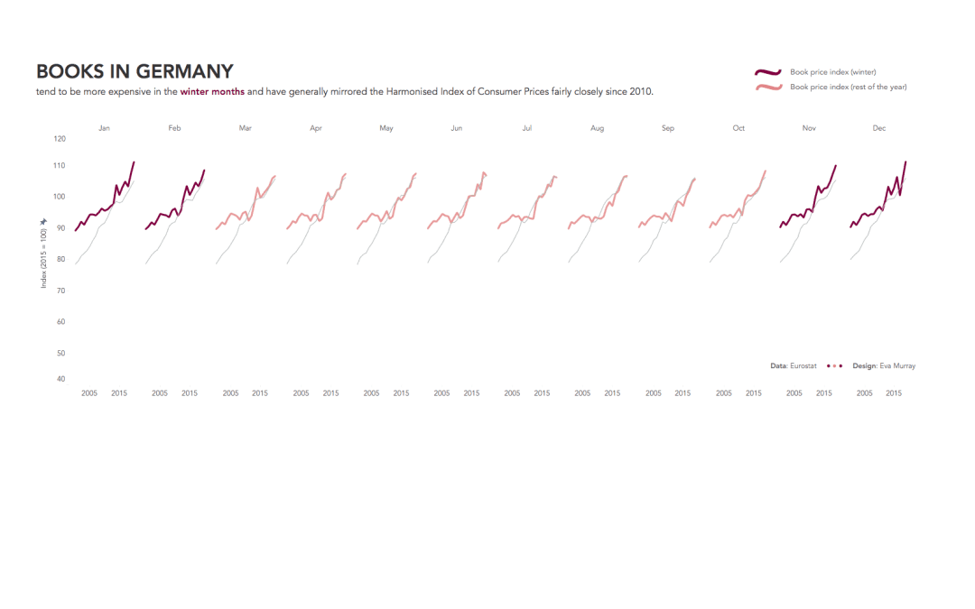
We haven’t used time series data in MM for a while, so I was pleased to find a dataset that combined several years of data at the month level with a topic I love: books and reading. The original visualization comes from Eurostat...
by Eva Murray | Sep 18, 2020 | Makeover Monday, Tableau
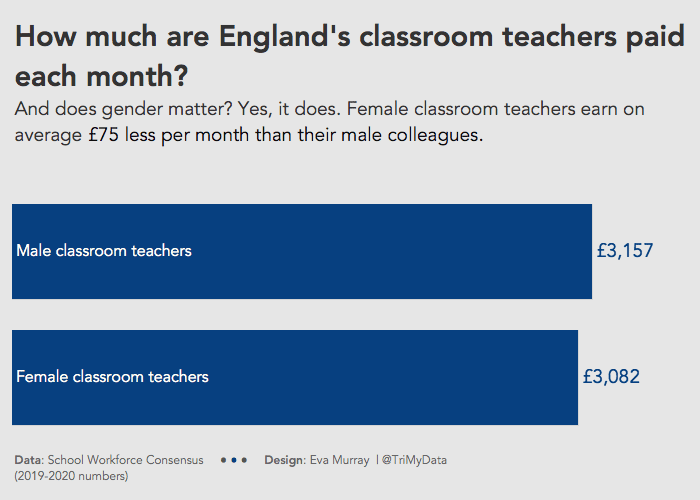
This week has to be quick because I’m official on holidays and it’s so sunny outside that it would be criminal to spend too much time in front of a screen. Charlie selected a dataset about teacher salaries in England. I saw a lot of cool visualizations...