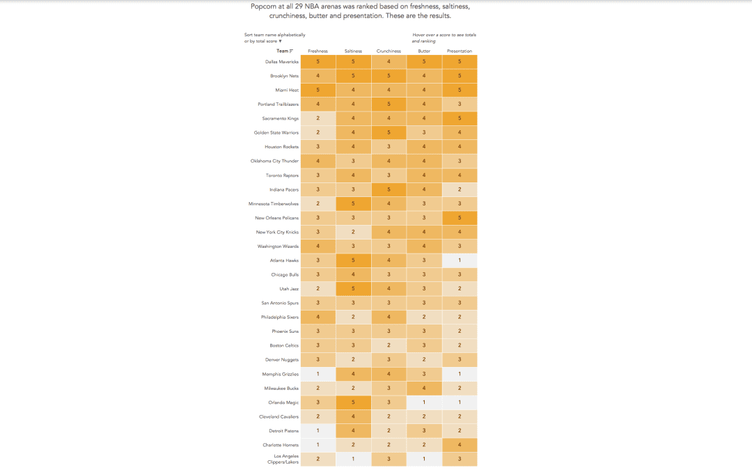
by Eva Murray | Apr 22, 2019 | Tableau
Andy found a great dataset for this week’s challenge: rankings of stadium popcorn at NBA stadiums across the US. It’s in an article by the New York Times and here is the viz itself: What works well: It’s a great viz of the ranking with clear labels...
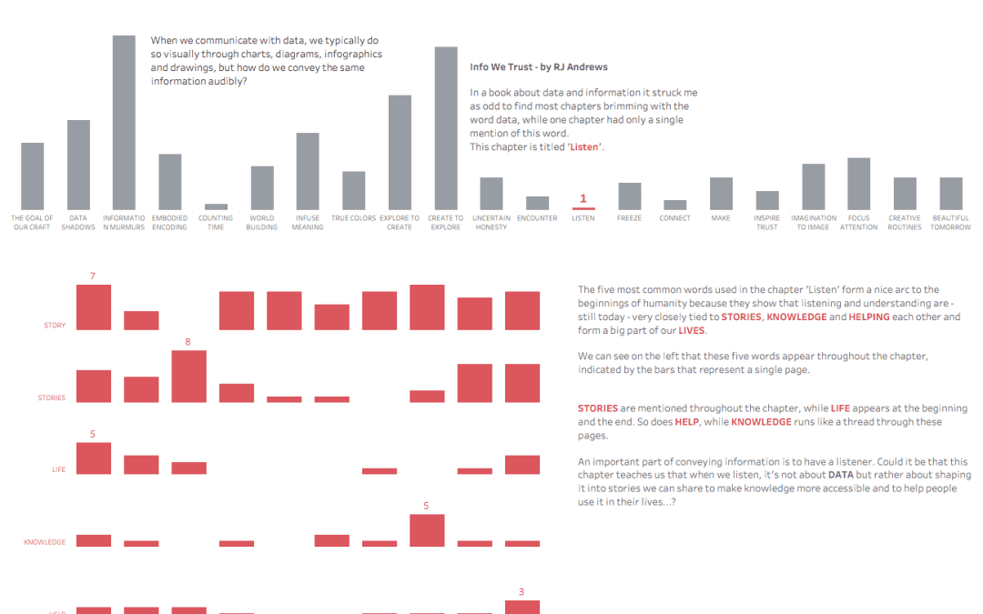
by Eva Murray | Apr 15, 2019 | Makeover Monday, Tableau
For this week’s makeover, we’re collaborating with RJ Andrews on his recent book ‘Info We Trust’. RJ gave me a fun word cloud and the data behind the 270 most common word-forms in the book. Something totally different from what we normally do,...
by Eva Murray | Apr 9, 2019 | Makeover Monday, Tableau
For this week’s Makeover, Andy picked a dataset that looks at the fiscal health of all 50 US states. The original visualization looks like this: What works well: The colors are well-chosen, take into consideration color vision impairments and work well together...
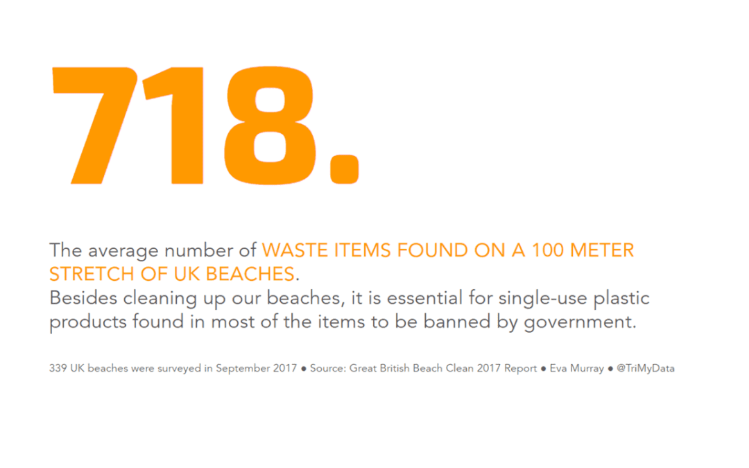
by Eva Murray | Apr 1, 2019 | Makeover Monday, Tableau
We as humans have a poor track record when it comes to looking after the planet we live on. Quite frankly, we’re awful at it and plastic waste is a massive contributor to the problem. A few weeks ago I came across this article by the BBC looking at plastic...
by Eva Murray | Mar 25, 2019 | Tableau
For week 13 we are using a viz about consumer spending by generation, using data that indicates what people spend their money on and how it differs depending on how old they are. What works well: A stacked bar chart that goes to 100% makes it easier to compare the...
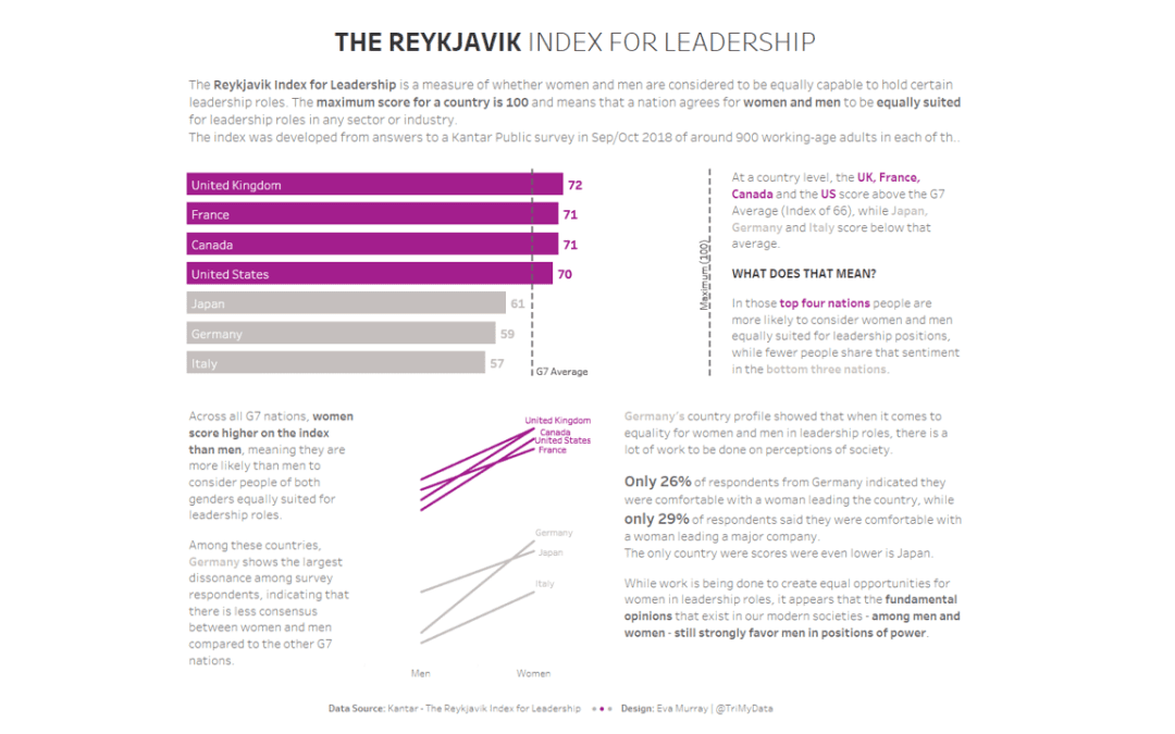
by Eva Murray | Mar 17, 2019 | Makeover Monday, Tableau
Following International Women’s Day in on 8thMarch, I decided to continue with a women and equality related dataset for thismonth. A few weeks ago, I came across an interesting viz that was part of anarticle about women in leadership roles and whether men and women...