by Eva Murray | Oct 8, 2019 | Tableau
For week 41, Andy chose a dataset about donations accepted by political parties, published by the electoral commission. The visualisation is an interactive Tableau dashboard, but it’s far from best practices and screams for a makeover… Here is what it...

by Eva Murray | Oct 2, 2019 | Tableau
For week 40 I chose a rich dataset with a simple viz showing population predictions for London. The original viz looks like this: https://media.data.world/Iz4UmqNeRlmouvVKnBXx_Screen%20Shot%202019-09-28%20at%207.23.28%20pm.png What works well: A simple bar chart...
by Eva Murray | Sep 24, 2019 | Makeover Monday, Tableau
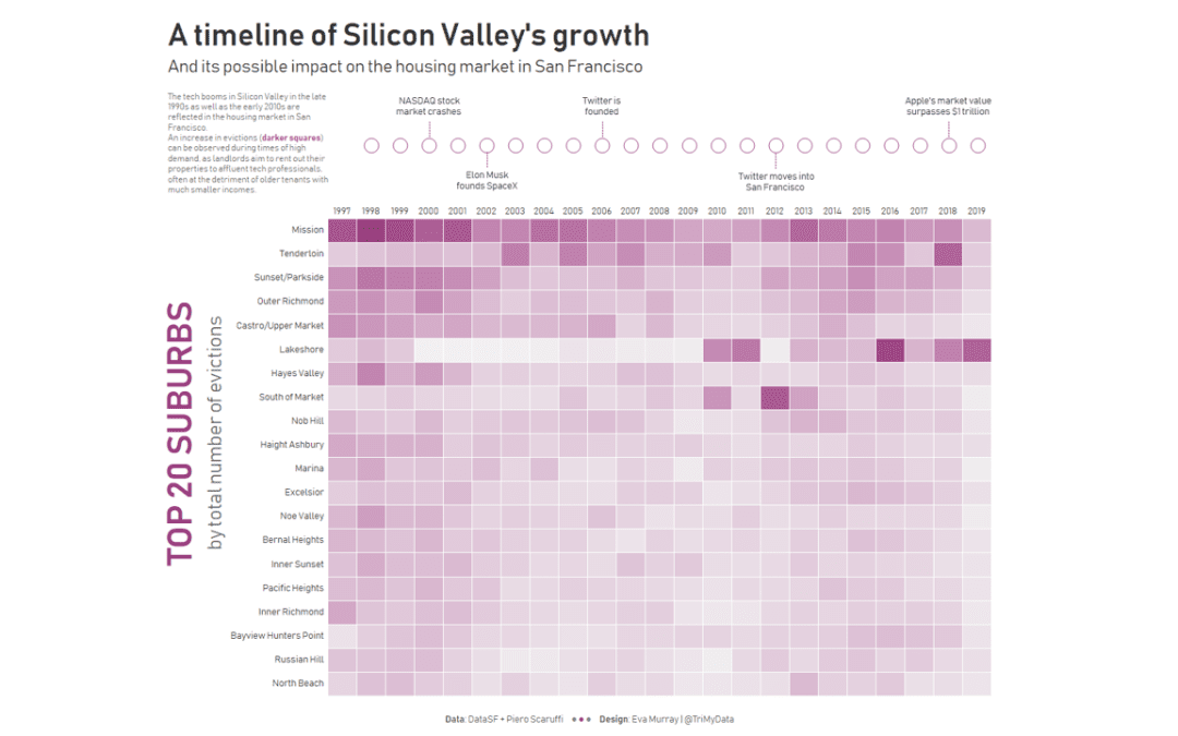
For week 39 we are looking at eviction notices for San Francisco, leading to tenants having to vacate their homes. The original article investigates possible reasons for these evictions and finds strong indications that evictions – for whatever reason –...
by Eva Murray | Sep 15, 2019 | Makeover Monday, Tableau
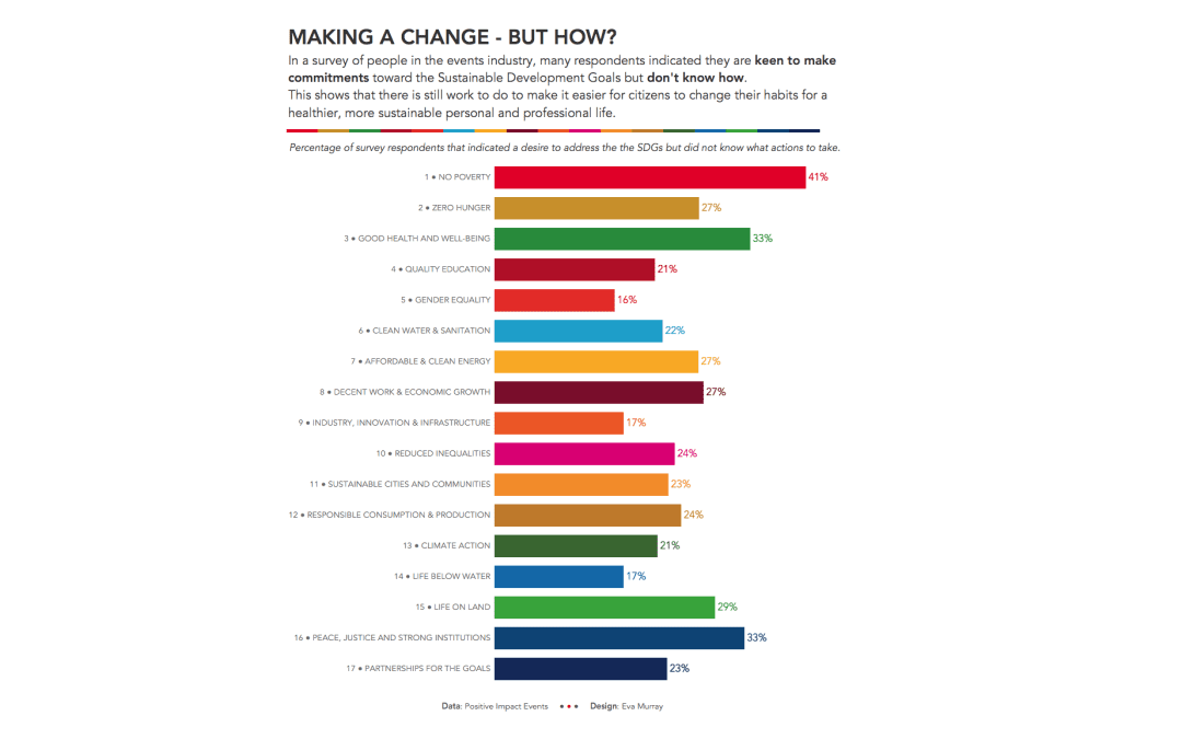
This week #MakeoverMonday is collaborating once again with the team of the SDG Action Campaign ahead of the Global Goals week during the UN General Assembly. A survey was opened to respondents from the events industry to measure their commitment to sustainability,...
by Eva Murray | Sep 9, 2019 | Tableau
There is a dataset we’ve had in our backlog for months and I’m excited that Andy decided to use it for this week. It’s about book checkouts at the Seattle Public Library, particularly those of work by James Patterson. James who? Due to the size of...
by Eva Murray | Sep 1, 2019 | Tableau
September 1st is the first day of autumn, meteorologically speaking. So I picked a dataset about how Americans feel about the different seasons. The original viz and data comes from YouGov and looks like this: What works well: It’s a simple bar chart that is...