by Eva Murray | Nov 17, 2019 | Life stuff, Tableau
As I type this, I’m into the last 2 hours of my flight home from Las Vegas, having spent six days there for #data19, Tableau’s annual conference. Talking to some of my old and new friends and reflecting onthe week in Vegas made me think there is a need for a little...
by Eva Murray | Nov 12, 2019 | Tableau
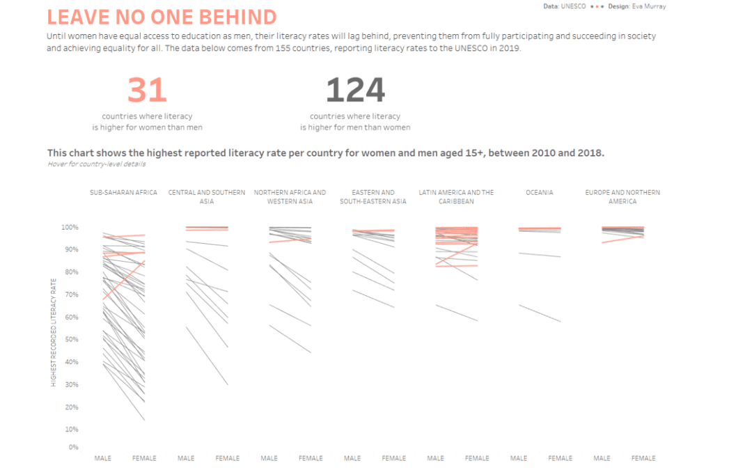
#data19 has arrived and with it a live #MakeoverMonday session with A LOT of people. We want to use that opportunity of getting everyone in a room with their ideas and skills to tackle a topic that is very relevant today. Literacy and how literacy rates differ across...
by Eva Murray | Nov 4, 2019 | Tableau
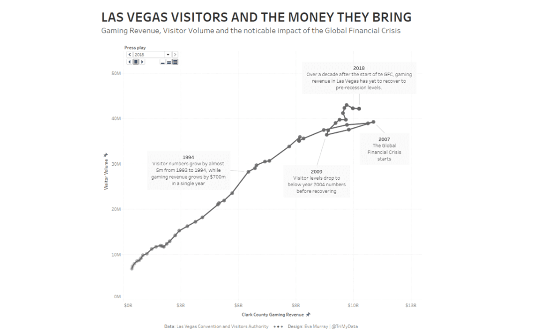
For week 45, Andy selected a dataset about Las Vegas. Itcontains a number of metrics, including visitor numbers, gaming revenue,occupancy rates, etc. This is the original viz What works well: The bar chart is simply and easy to read The line shows an interesting...
by Eva Murray | Oct 28, 2019 | Tableau
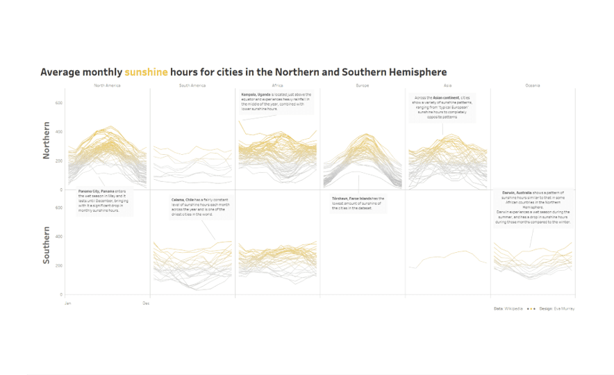
Before winter really takes hold, let’s look at some sunshine hours in cities around the world. Here is this week’s original: What works well: Captivating visual that makes me curious The bar charts at the bottom are nice Top 5 lists at the beginning are...
by Eva Murray | Oct 21, 2019 | Makeover Monday, Tableau
Content warning: This post and the data visualisations within it focus on the topic of suicide. If you are not comfortable with the topic, please don’t feel obliged to continue. If you or someone you know needs help, please contact: Samaritans (UK: 116 123)...
by Eva Murray | Oct 13, 2019 | Tableau
What a spectacular weekend in endurance sports: on Saturday morning, Eliud Kipchoge became the first person to run a sub-2 hour marathon, then the Ironman World Championship race in Hawaii saw a double German win with Jan Frodeno taking gold in the men’s race...