by Eva Murray | Nov 4, 2020 | Makeover Monday
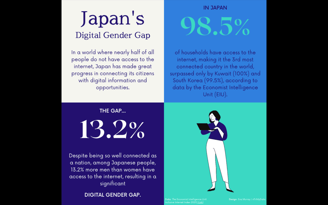
It’s time for another #Viz5 challenge and this time we’re analysing data about the digital gender gap – just how big is the difference between men and women when it comes to accessing the internet and mobile devices? The team at Operation Fistula...
by Eva Murray | Oct 20, 2020 | Makeover Monday, Tableau
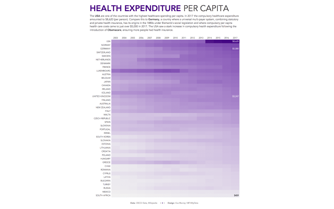
A quick viz this week and a quick blog, looking at health spending per capita in different countries. I’ll admit, I wanted to do a heat map before even looking at the data, so a heat map it is. This week we’re looking at OECD data about healthcare...
by Eva Murray | Oct 12, 2020 | Makeover Monday, Tableau
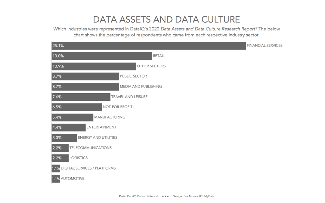
For week 41, Charlie found a whopper of a chart that is in such desperate need of a makeover. After last week’s excitement around #data20, this week should see us all relax a little and go back to business. So here is this week’s visualization from DataIQ,...
by Eva Murray | Oct 5, 2020 | Makeover Monday, Tableau
This week it’s time for #data20, Tableau’s virtual conference and to get everyone’s engine warmed up, we’re hosting live Makeover Monday events (Morning and Afternoon session) because we do every Monday before conference. They’re just...
by Eva Murray | Sep 18, 2020 | Makeover Monday, Tableau
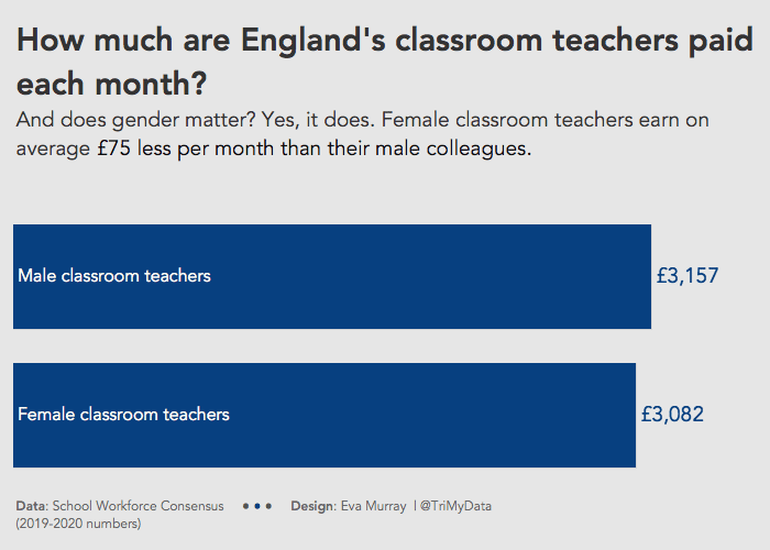
This week has to be quick because I’m official on holidays and it’s so sunny outside that it would be criminal to spend too much time in front of a screen. Charlie selected a dataset about teacher salaries in England. I saw a lot of cool visualizations...
by Eva Murray | Jul 16, 2020 | Makeover Monday, Tableau
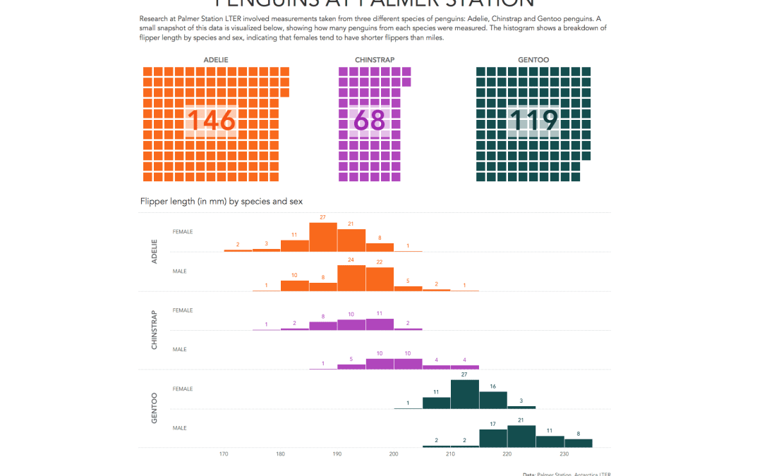
Sometimes I stumble across dataviz gems with topics that make me smile. This is one of those weeks with the topic being the flipper and bill length of different types of penguins in Antarctica. The original viz and fantastic data prep work + art work comes from...