by Eva Murray | Feb 13, 2021 | Makeover Monday, Tableau
This week we’re visualizing another #Viz5 dataset, this time about perceived obstacles to Gender Equality. The original viz is this: What works well: Detailed description Detailed results What could be improved: While details can be helpful, in this case I find...

by Eva Murray | Feb 4, 2021 | Makeover Monday, Tableau
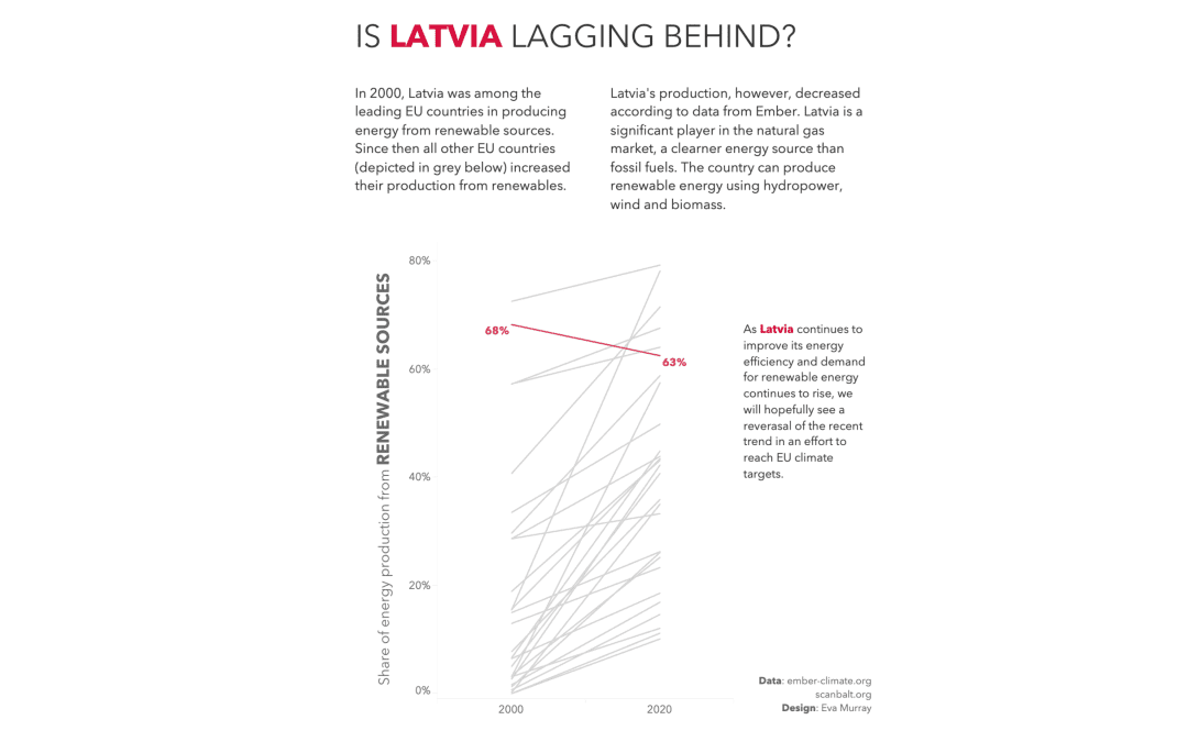
We’re sticking with the energy theme this week and look at renewable versus fossil fuel production in EU countries. The original visualisation comes from the EU Power Sector 2020 report from ember-climate.org: What works well: The title connects well to the...

by Eva Murray | Jan 28, 2021 | Makeover Monday, Tableau
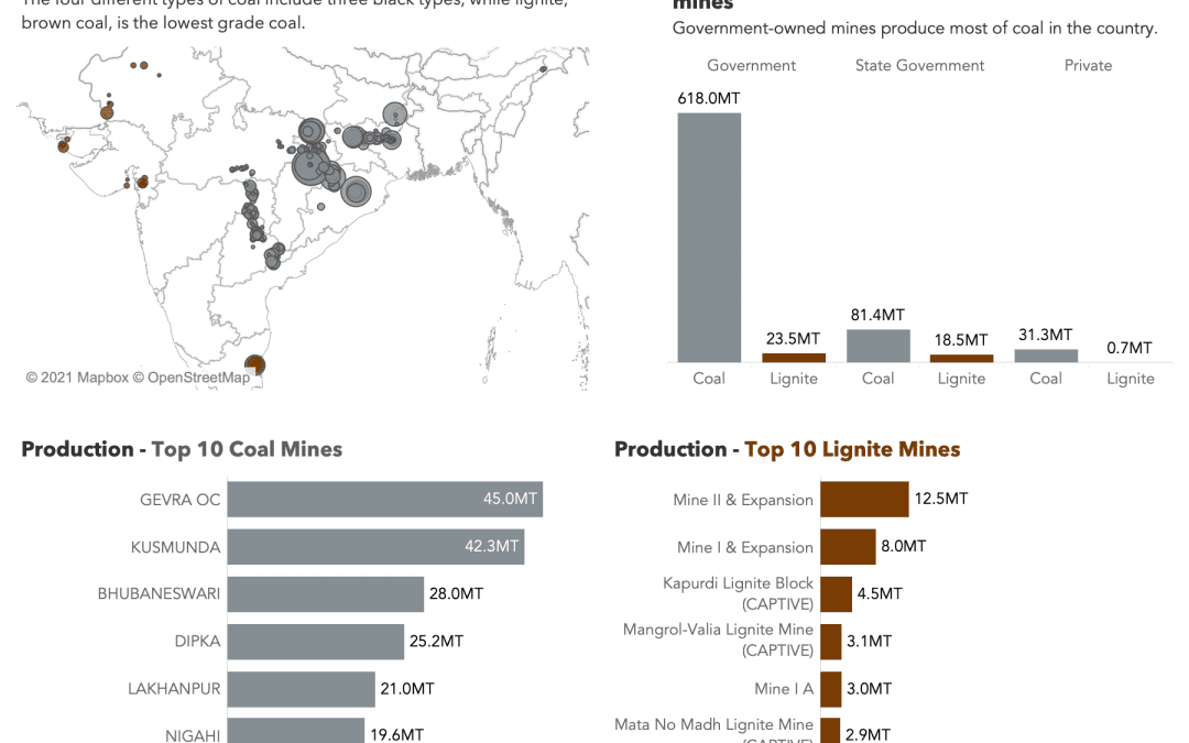
This year for #MakeoverMonday we made a change and now Andy is in charge of ALL the data while I’m in charge of the entire feedback process. We both get to do the things we enjoy the most and one benefit for me is that I don’t know what’s coming each...

by Eva Murray | Jan 21, 2021 | Makeover Monday, Tableau
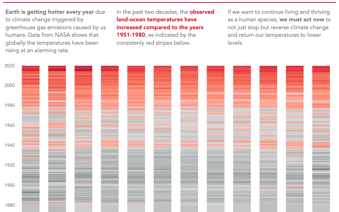
For this week Andy chose a dataset about global warming, a topic that has been largely ignored in the media during 2020 as everyone’s focus shifted to the COVID pandemic. But here we are, getting closer and closer to the point where irreparable damages will be...

by Eva Murray | Jan 11, 2021 | Makeover Monday, Tableau
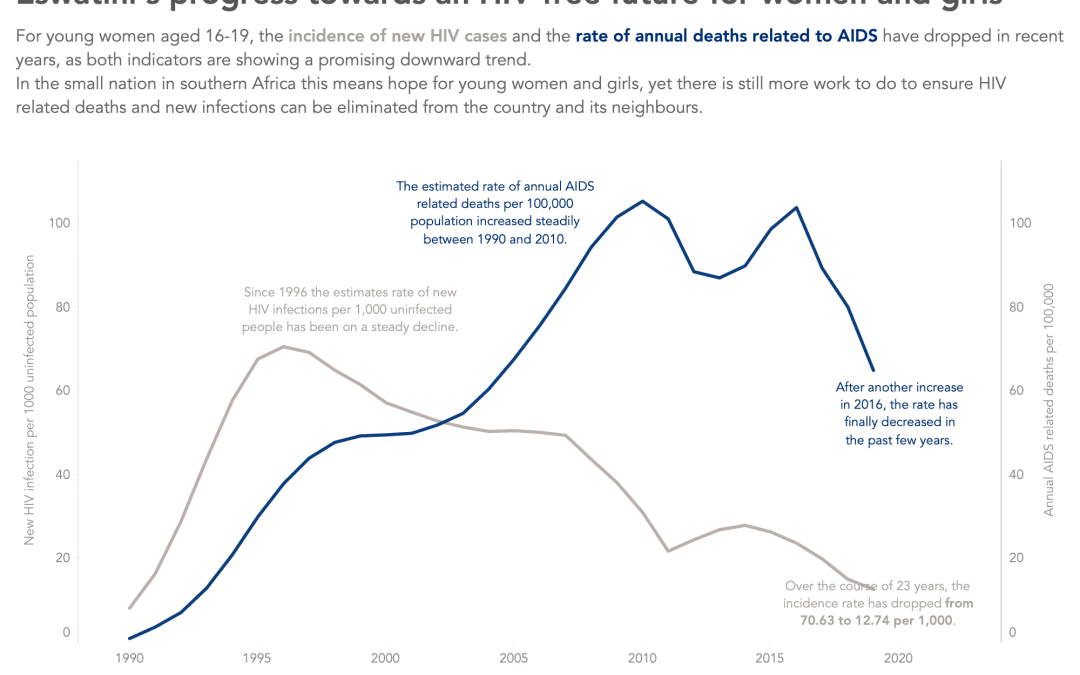
This week we’re tackling another Viz5 dataset to highlight gender inequality in new HIV infections among adolescents. The data comes from UNICEF and was provided to us by Operation Fistula who also created the original visualization: What works well: Key metrics...

by Eva Murray | Dec 28, 2020 | Makeover Monday, Tableau
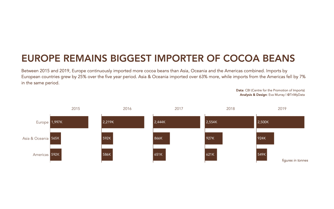
This has to be quick. 2020 somehow still hasn’t finished and this Monday has been dragging on for what feels like 40 hours now. Let’s make it a bar chart to end the year. But first: Here is the original viz, looking at cocoa import stats for regions across...


