by Eva Murray | Mar 3, 2019 | Makeover Monday, Tableau
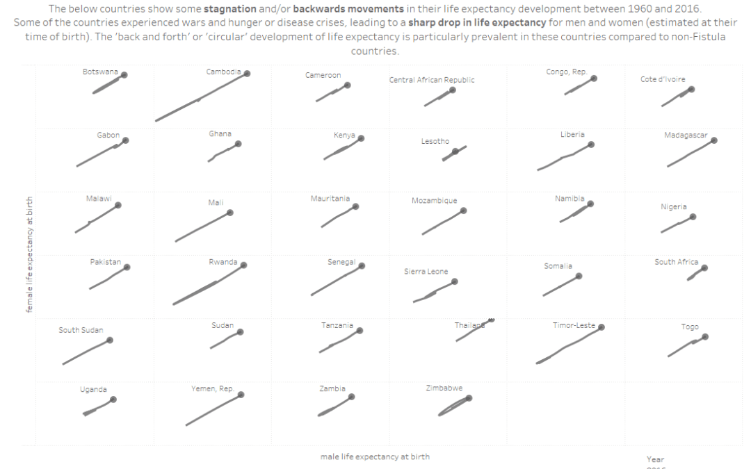
For week 10 we are collaborating with the team at Operation Fistula to support their mission and to bring more visibility and awareness to the issue of obstetric fistula (‘the worst thing you’ve never heard of’). The dataset is large in terms of...
by Eva Murray | Feb 25, 2019 | Makeover Monday, Tableau
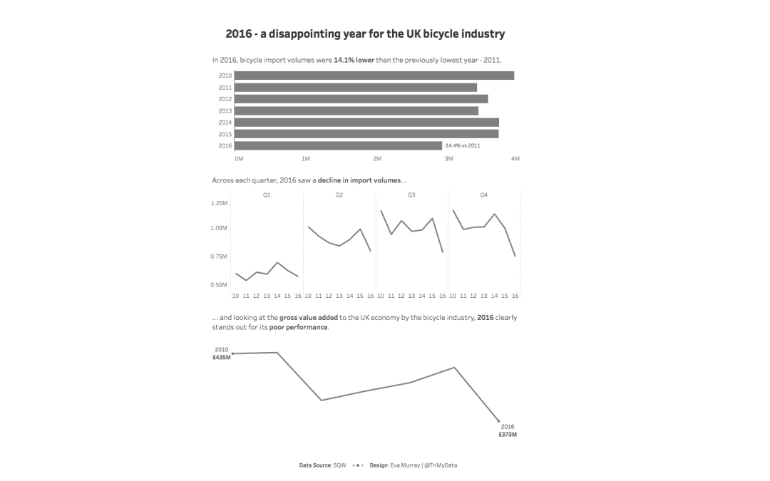
For this week’s MakeoverMonday challenge, we look at data about bicycle imports to the UK from 2010 – 2016. The original viz comes from a report by SQW and looks like this: What works well: Using a line chart for time series data Showing quarterly data...
by Eva Murray | Feb 17, 2019 | Makeover Monday, Tableau
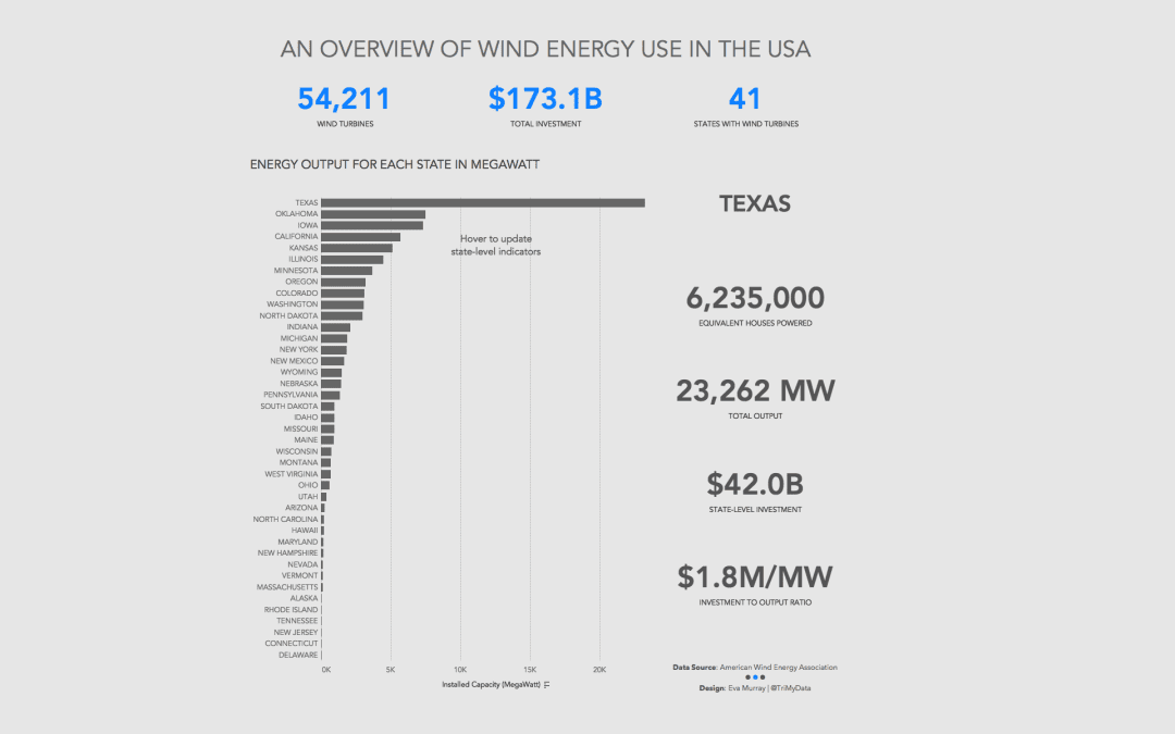
This week we look at how much wind energy is produced in different US states. The original viz (and awfully opinionated, anti-wind energy article) comes from howmuch.net: What works well: States are sorted in descending order from highest to lowest installed capacity...
by Eva Murray | Dec 23, 2018 | Makeover Monday, Tableau
And here we are, week 52 of 2018. Another year has come to an end. It’s year 3 for #MakeoverMonday, the social data project, year 2 for me being part of this project and I get to look back on two eventful and exciting years of driving this project for the...
by Eva Murray | Dec 17, 2018 | Makeover Monday, Tableau
In September this year, Andy was hit by a bus while out on a ride. I had a few close calls myself over the years with cars, buses and trucks. Especially in Australia, where many drivers sadly treat cyclists like cockroaches. But even in Germany, a country where most...
by Eva Murray | Dec 10, 2018 | Makeover Monday, Tableau
It is week 50 already and where has this year gone? The 50th week of Makeover Monday in 2018 and another opportunity to improve the way we visualize and analyze data. This week we’re looking at the land use for producing different food types. What works...