#MakeoverMonday Week 11 2021: What is the World's Biggest Cash Crop?
The visualizations we use for #MakeoverMonday are usually in need of a makeover but sometimes we use visuals that are already really good, and they cover an interesting topic or really good dataset.
This week we’re looking at crops - what’s grown, how efficient are the crops and how popular and profitable are they. The original visualization comes from Information is Beautiful.

What works well:
The unit bar chart at the top looks great! It’s very neat and easy to read.
The sorting of the first column is clear (but it would be nice to have the option to sort by the other metrics).
The definitions for the different metrics is useful and concise.
What could be improved:
The colors are a bit meh. I understand the use of green for ‘planted’, but then the rest of the colors kind of go with the theme and kind of don’t. I wouldn’t combine the greens with the brownish red.
The second chart has similar colors but they have a different meaning.
The bubbles don’t seem to be sorted in any particular order and I find that chart to be so large that it’s difficult to see on one screen to take in the relation of the size of each bubble to the others.
What I did:
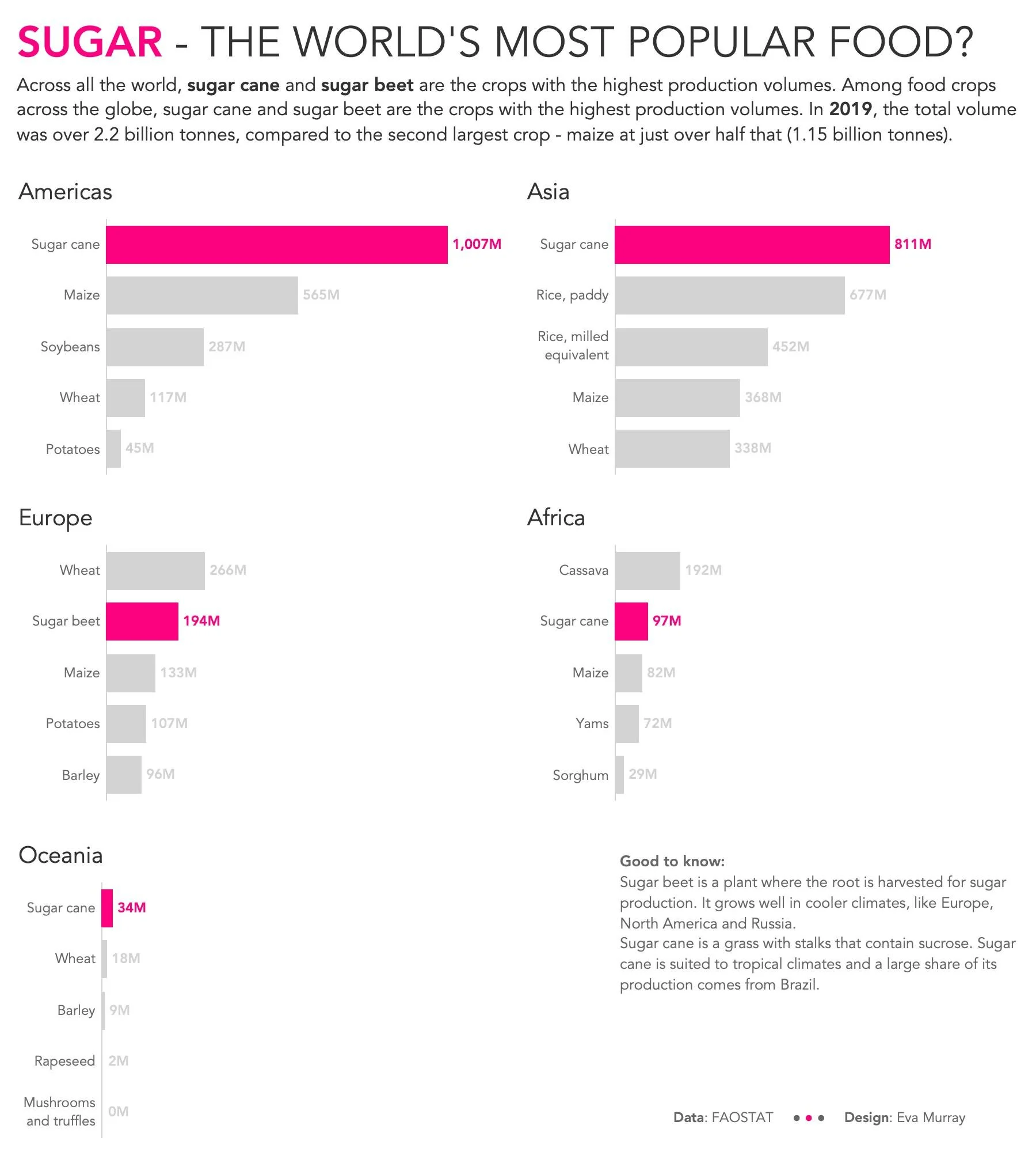
I noticed sugar cane and sugar beet production ranking in the top 5 crops for each region so decided to focus on this.
Noticeable is not just the production volume but also that sugar beet is much more popular in Europe than the other regions, due to the climate there.
click on the image to explore the interactive version