#MakeoverMonday 2020 Week 50: A Statistical Analysis of the Work of Bob Ross
Who doesn't love Bob Ross? I imagine that most people who have seen him on TV have been mesmerized by his ability to capture beautiful landscapes with the dab and the brush stroke of his paint brushes with such apparent ease that made everyone feel like they themselves could do this too.
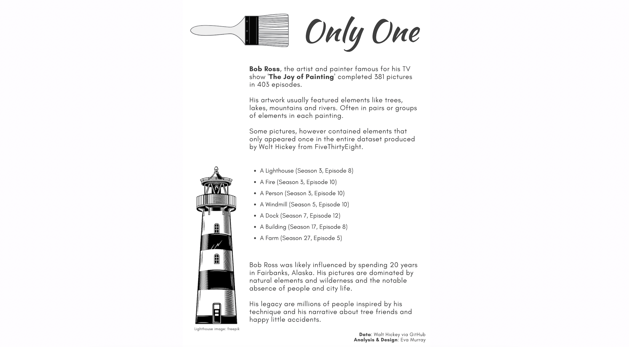
This week's dataset is all about the work of Bob Ross and the elements in his paintings and the frequency with which they appear. The original visualization is from fivethirtyeight:

What works well:
- The charts from FiveThirtyEight are typically very neat and tidy, simple and easy to understand. This one is no exception.
- The colors are simple and work well together (background, font, chart).
- Labeling the first bar with a percentage makes it easy enough to read and understand the subsequent bars.
What could be improved:
- I'd love the author's 'take' on this. The article is an excellent write up of their analysis and observations and it would be good to have some of those points included in the chart itself.
What I did:
- I didn't want to simply recreate the original.
- I also think there are enough visualizations already made about the frequency of trees, mountains, rivers and lakes in Bob Ross' images.
- So I decided to look at the bottom of the list and focus on the items that hardly ever feature in his work.
- Once again: analysis done in Tableau, design done in Canva.
