#MakeoverMonday 2020, Week 11: Self-reported life satisfaction vs GDP per capita
It's been a crazy last few days and there is no point avoiding to talk about it. I would not be honest if I sais #MakeoverMonday is high on my priority list right now. As we all figure out the new situation around the world, working from home, taking care of children, elderly relatives, pets, neighbours, doing a weekly, fun dataviz exercise seems almost silly at times.
But of course we continue and those who want to join us, who want to continue their weekly practice, are more than welcome at any point! This bit of 'normality' that we're all used to will continue to be around.
We just need to be mindful that a lot of people have other things happening in their lives and that with changing work schedules and wfh setups, some things will change for a period of time.
Let's figure this out together and continue building our skills. Now is actually the right time to do it for our own sake but also because we can use the time we have 'freed up' by not commuting to finally tackle some of these activities we may not have had time before.
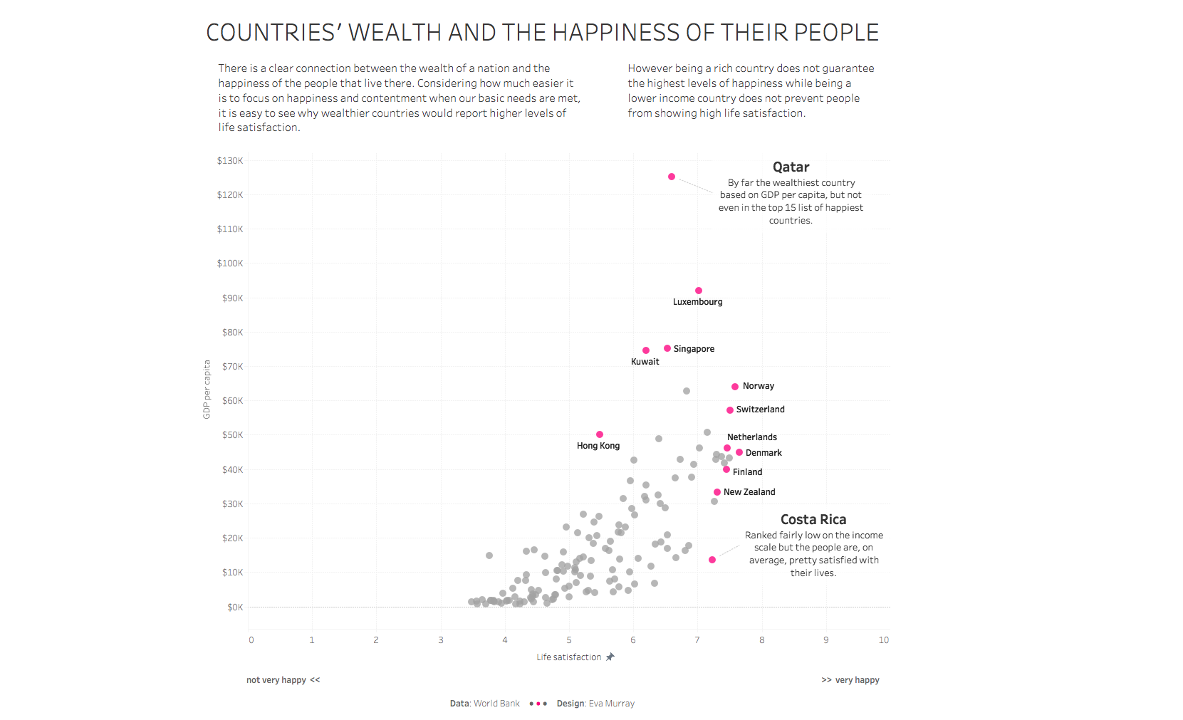
For this week's #MakeoverMonday challenge, Charlie chose a chart from 'Our World in Data' on Live Satisfaction vs GDP per capita.

What works well:
- The chart contains a great level of detail without looking too cluttered.
- For people who know how to read a scatterplot, this will be easy to understand.
- The description under the title is helpful context.
- The coloring is helpful.
What could be improved:
- Once I used the animation over time, things became selected and I did not manage to go back to the original view which was frustrating.
- Why are people still using red and green in a single chart?
- While I understand the idea behind the arrows that appear during the animation, I find they add a lot of visual clutter and don't really help me, because then every country has an arrow going into some possible direction.
What I did:
- a simple viz this week and while I wrote the previous sections of this blog 3 days ago, I'm not in the mood to add any more stuff, so here's the picture
