#MakeoverMonday 2020 Week 3: Is it time to treat sugar more like smoking?
For week 3, Charlie picked an article and a viz about sugar and the high level of consumption of sugar in the UK by different age groups.
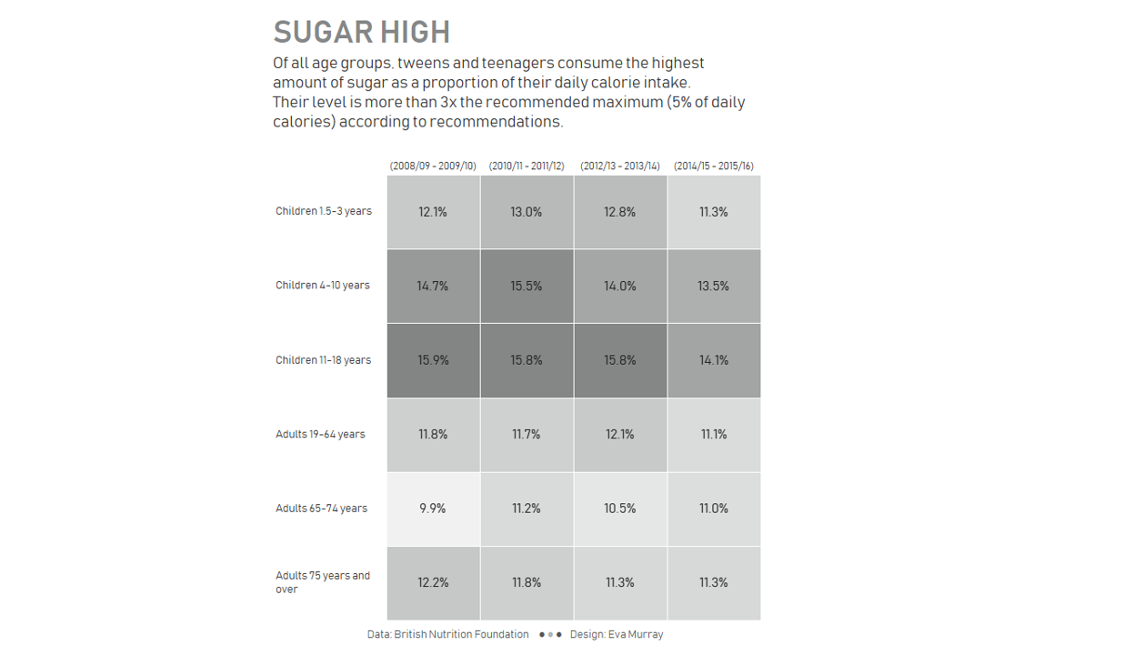
Here is the original viz from the BBC:
Work works well:
- Simple bar chart
- Use of a single color
- Good title and subtitle
- Note is helpful to provide context for the 'claim'
- Data Source is included
What could be improved:
- The axis label should include the % symbol for all of them. I think that would make it clearer.
- I don't think this needs color at all.
- There are many age bands --> could they be grouped into larger bands?
- It looks like everyone consumes more sugar than they should, so while the teenagers have the highest consumption (longest bar). they con't stand out particularly, because the reference line demands my attention
What I did:
- Today, together with Chris Meardon and Angelos Pachis, I ran a MakeoverMonday live webinar hosted by Tableau's Sagar Kapoor as part of the #VizConnect initiative.
- We created our makeovers during that session, so there was time pressure. It took me about 20min to created the heatmap below and while it isn't particularly insightful, I like the simplicity of it and that I created something quickly and managed to format it while broadcasting the process live :-)
- Click on the image for the interactive version
