#MakeoverMonday | Week 49 | 2019: How much does union membership benefit America's workers?
For week 49, Andy picked a dataset about union membership, from an article by Mona Chalabi, who writes for the Guardian and is a recognised journalist who uses data visualisation and data art to make information more accessible.
I like Mona's work and have read a number of her articles, as well as seen her TED talk. No doubt, she is an artist, but I still have a few points to say about the viz Andy chose for this week's makeover. I know there are plenty of Mona fans out there in our community and I have noticed a trend of not critiquing the work of famous people because people want to connect with and be known by said famous people.
I don't care about fame. I recognise and respect the skill and effort that goes into people's work, but that doesn't mean we cannot look at it with a critical eye. After all, I spent hours and hours interpreting and critiquing Goethe, Schiller and their mates during high school and their work was brilliant.
So here we go:
The original viz:

This viz is actually three separate images that are placed in the article.
What works well:
- The charts are placed within the context of the article, illustrating the points Mona makes and showing the differences between demographic groups that she describes.
- There is a clear color choice for sex and ethnic background.
- The style or symbols used for union membership and non-members is explained in the first chart.
- All the axes are the same, making it easier to compare across the aggregated data as well as the sex- and ethnicity-disaggregated data.
What could be improved:
- Where are the actual data points? The charts have arms rather than clear lines and I don't know where the end points are for non Union members because between the heel of the hand, the thumb and the finger tips, there are many options. This comes with the nature of the illustration but given the exact numbers cited in the article, I find it very difficult to see the data points Mona mentions.
- In the chart on the far right, the arms are all really close together. But how close are the data points really?
- The purple background, again, part of the design, doesn't seem necessary. I don't understand why there are three different shades of purple.
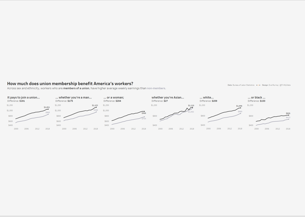
What I did:
- This time I focused on addressing the points I raised above, trying to create a true makeover of the original vizzes while sticking as closely to the original as possible.
- I typically don't do really wide vizzes but in this case it helps with comparing the height of each line, i.e. the wage.
- click the image for the interactive version:
