#MakeoverMonday | Week 40 | 2019: London Population Predictions
For week 40 I chose a rich dataset with a simple viz showing population predictions for London.
The original viz looks like this:
What works well:
- A simple bar chart showing the predicted population growth for London
- Tooltips provide exact values
- Simple color
What could be improved:
- Without any context, this chart is not easy to understand.
- What does 'Number' mean?
- Why is there a color legend for a single color?
- What is actual versus prediction?
- Where are these numbers from?
- What year were these numbers from?
- So what? What does any of this mean and why does it matter?
What I did:
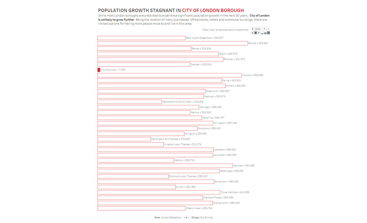
- What stood out for me was the City of London borough which doesn't really have room for more people.
- While all other boroughs will grow, this one won't and to me that's such a stark contrast that I focused my viz on it.
- Went with an animation which doesn't work on Tableau Public, but it does in this gif below...
- Viz here
