#MakeoverMonday | Week 31 | 2019: STD Infection Rates in America
This week's #MakeoverMonday takes us to one of Andy's very first vizzes and one of the first vizzes published on Tableau Public (he published 8 vizzes the day the platform went live). We're looking at STD infection rates in America and the original dashboard looks like this:
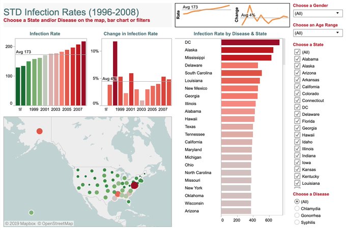
What works well:
- The title is short and to the point.
- Andy made the effort to display a lot of information at once (I'm not biased, I just want to keep in mind that this is VERY early in his Tableau journey, so lots of newbies will face similar challenges).
- Instructions for interactivity.
What could be improved:
- The dashboard is very busy with lots of elements, colors and labels. Simplicity is best.
- Too much color. Red and green is not a recommended combination as it isn't color-blind friendly.
- The filters could be all the same type, e.g. single or multi select drop downs.
- What's the story here? What are we as the audience supposed to get from this information?
- The data source is not included, but where did this data come from?
What I did:
- I always start by looking at the data, i.e. the actual numbers in the data connection window in Tableau. In this case it helped me to quickly understand the type of fields and records I am dealing with.
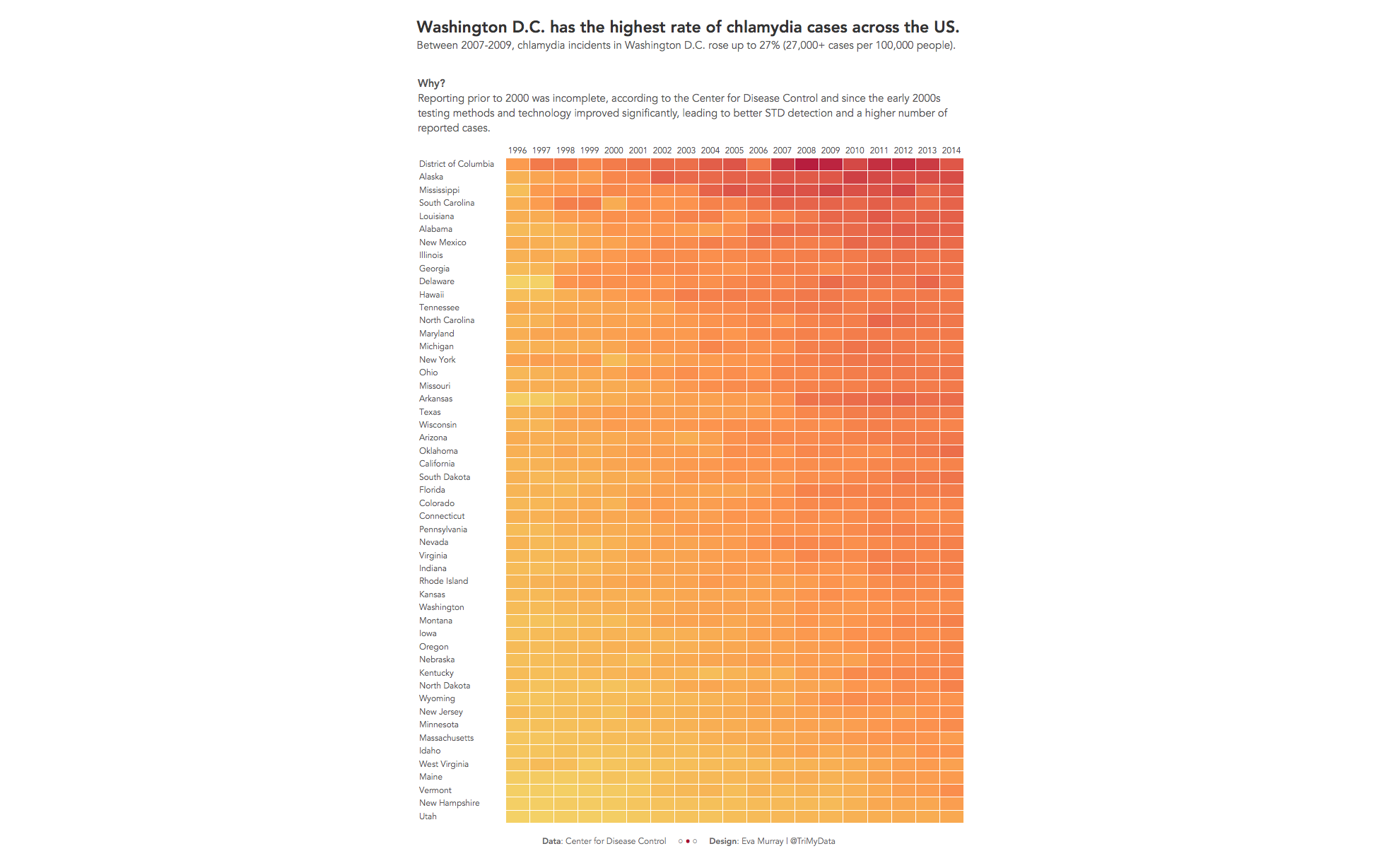
- After some analysis I decided that the change over time was significant and that chlamydia seemed to have the biggest change of the disease in the dataset, so I focused on that.
- Looking at the data at a state level showed some interesting differences. I didn't expect to find Washington D.C. leading the ranking with the highest cases of chlamydia per 100k people. Utah having the lowest number of cases didn't come as a surprise though.
- Here is my viz:
