Makeover Monday | Week 17 | 2019: Stephen Curry's Stadium Popcorn Rankings
Andy found a great dataset for this week's challenge: rankings of stadium popcorn at NBA stadiums across the US.
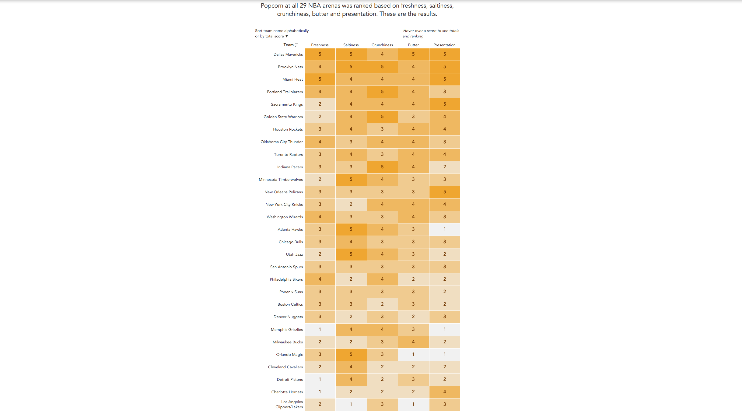
It's in an article by the New York Times and here is the viz itself:

What works well:
- It's a great viz of the ranking with clear labels and scores
- I really like how scrolling down in the article freezes the column headers so you still know what each column relates to
- The title is clear and succinct
- The scoring is simple
- The white borders for each cell make the viz look neat
What could be improved:
- I'm not a huge fan of the color, I'd go for something more in the yellow and golden range
- I'd love to see some conclusions, such as 'most teams score high on xx but low on yy' or so. Something that makes me as the audience think a bit further about the data
What I focused on:
- I started by looking at Andy's visual vocabulary for some inspiration for rankings.
- I tried a few different approaches but nothing excited me and I really liked the original.
- So I redid it in Tableau, without adding too much fuss to it.
- One addition is to be able to sort the teams by total score or alphabetically, making it easier to find a team in the list
- Here is my viz, click to view the interactive version
