Makeover Monday | Week 14 | 2019: What kind of waste appears on UK beaches?

We as humans have a poor track record when it comes to looking after the planet we live on. Quite frankly, we're awful at it and plastic waste is a massive contributor to the problem.
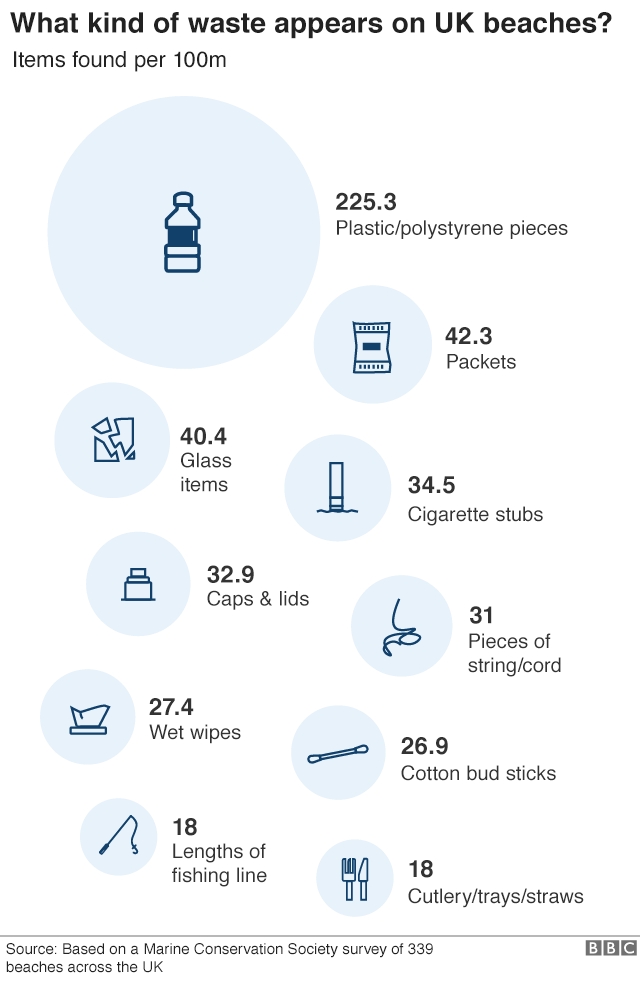
A few weeks ago I came across this article by the BBC looking at plastic pollution and thought it would be the perfect topic for Makeover Monday because our community never fails to impress me with the creativity they bring to data visualization challenges.
Here is the original chart:
What works well:
- The title is clear and easy to understand. Putting it into the form of a question guides me in how I look at the chart.
- The subtitle gives the data context.
- The numbers and labels help me understand the detail.
- The icons and overall design is fairly engaging.
- The data source is stated.
What could be improved:
- Sized circles are very hard to compare to one another - a bar chart would be a better option.
- While I can imagine a beach that's 100m long, it would still be helpful to give some more perspective on just how much rubbish is found .
- Are things getting better or worse? How is the type of waste that's found changing over time?
What I focused on:
- The numbers are staggering and I was reminded of a very impactful viz by Curtis Harris that he created last year.
- I wanted to see if I could let a single number stand on its own.
- So no Tableau this time, just PowerPoint.
