Makeover Monday | Week 8 | 2019: Which States produce the most wind energy?
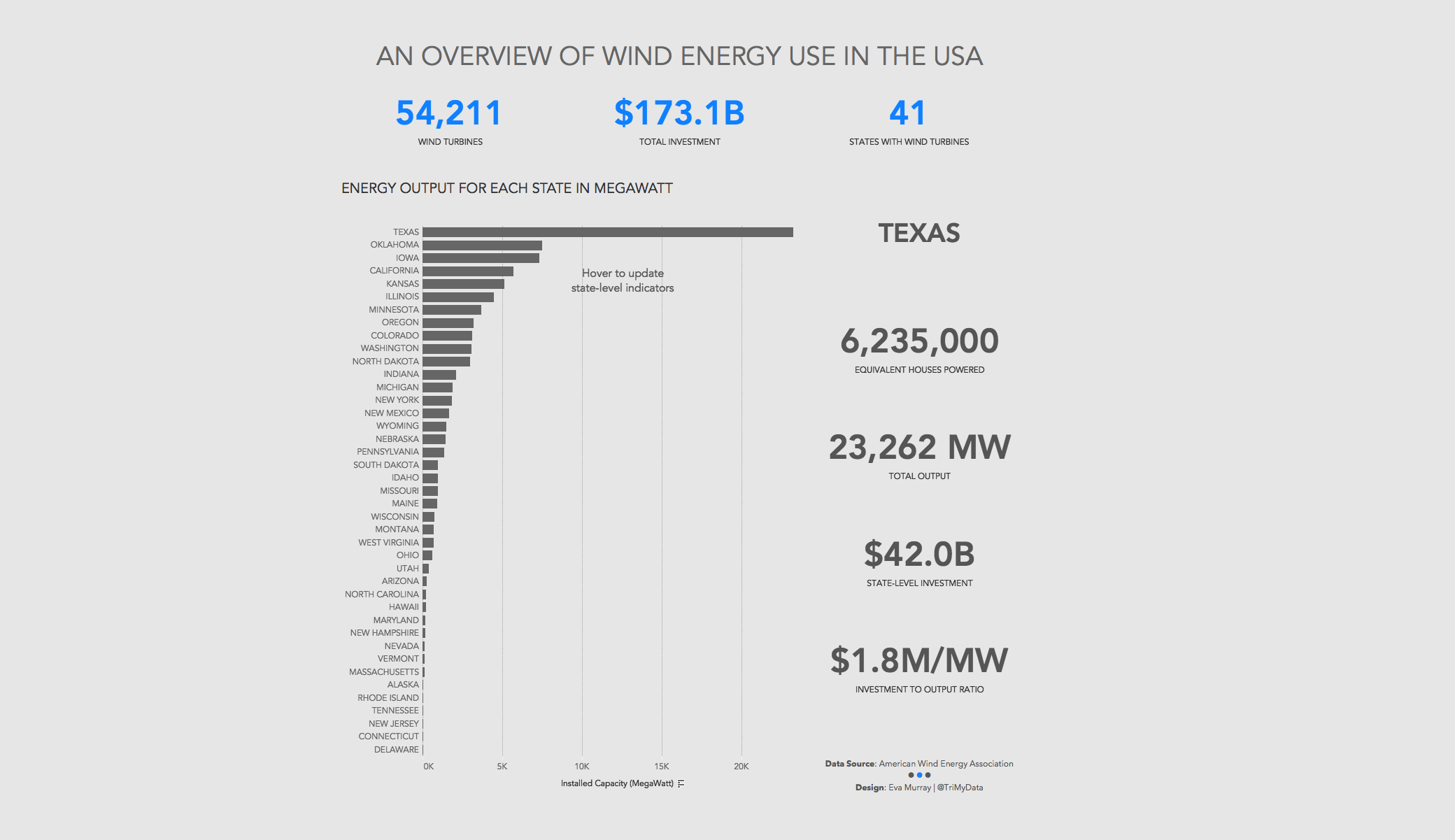
This week we look at how much wind energy is produced in different US states. The original viz (and awfully opinionated, anti-wind energy article) comes from howmuch.net:

What works well:
- States are sorted in descending order from highest to lowest installed capacity
- The title is short and captivating (even if a little vague)
- Adding the total investment figures below each state adds further context
What could be improved:
- The y-axis: the distance from 100 to 1,000 is as large as that from 10,000 to 20,000. That makes no sense, especially when the visualization is essentially a gimmicky bar chart that starts at zero
- Equally, the color suggests grouping into bands of unequal sizes
- The labelling is not aligned consistently with gaps on the x-axis becoming much smaller from left to right
- The labels at the far right are essentially illegible
- The icons are so unnecessary and cover much of the chart area without adding much value. A simple bar chart would have been a much better choice
What I focused on:
- I was keen to build another dashboard with BANs and to keep the viz itself quite simple
- I initially planned to include a scatterplot showing investment vs output but all states are pretty much on a straight line, so there is nothing particularly interesting to see there.
- I ended up with this:
