Makeover Monday week 51, 2018: London Bus Safety Performance

In September this year, Andy was hit by a bus while out on a ride. I had a few close calls myself over the years with cars, buses and trucks. Especially in Australia, where many drivers sadly treat cyclists like cockroaches. But even in Germany, a country where most drivers are also cyclists, drivers are impatient, aggressive and downright idiotic when it comes to cyclists in traffic. Admittedly, there are enough cyclists who risk their lives to get across a green light, cutting in front of cars, etc. But overall, we tend to not have a death wish, we want to get home safely and there are people in our lives who'd rather see us alive than attend our funeral.
So it is important to look out for pedestrians and cyclists alike, as they are the least protected participants in traffic, closely followed by motorbike and scooter riders, who - as opposed to cars - don't have a protective shell around them out there.
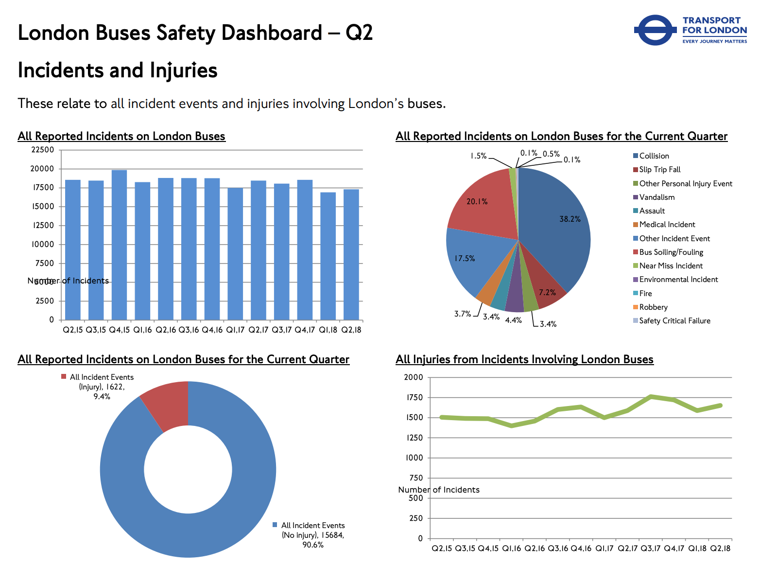
This week's dataset is about the performance of London buses on safety metrics, looking at incidents and injuries involving buses.
What works well:
- The title gives me a good idea what this is about
- The chart types are probably familiar to most people looking at this dashboard
What could be improved:
- I'm confused: it says Q2 in the title and two charts - the pie chart and the donut chart - seem to relate to that 'current quarter' but the other charts look at all quarters back until Q2 2015. What should I focus on?
- The pie chart makes it far too difficult to comprehend the information
- Everything is very squished together
- Are things getting better or worse? What's the verdict?
- If things are changing - why are they?
- Blue seems to mean something different in every chart
What I did:
- Initially I planned to create a proper KPI dashboard but when I looked at the data I realised it wasn't quite ready for that and I wasn't ready to spend the extra time required to make it happen
- I tried to follow my own advice and created a number of charts until I had a good understanding of what the different fields contained, what stood out. Or didn't.
- Funnily enough (as it happens to me so often), I was at the point of giving up and just slapping together a heat map for the nth time, when I thought 'I wonder what happens if I put route and borough into the same view. And voila - I had my story
- Here are the spikes that show months were incidents were higher than in previous months. I found the viz itself pretty neat and while the detail gets a bit lost due to the light colors of 'low incident months', the spikes stand out all the more visibly and that is my focus here.
- click for the interactive version
