Makeover Monday week 31, 2018: The Big Mac Index
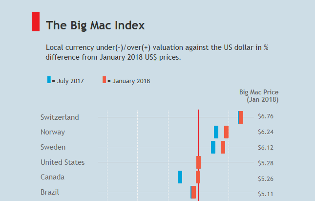
This week we're working on the dataset behind the Big Mac Index. Many from the community will be familiar with the topic because it featured in this year's Ironviz Europe contest.A few weeks ago, Andy Cotgreave introduced us to the data team at the Economist, who were keen to see what visualization ideas the community would come up with.I really enjoyed reading the article discussing the January Big Mac Index, because it breaks things down nicely, uses plain language to explain a potentially complex topic and uses examples for a number of countries from the list to further support the conclusions drawn. Here is the original visualization: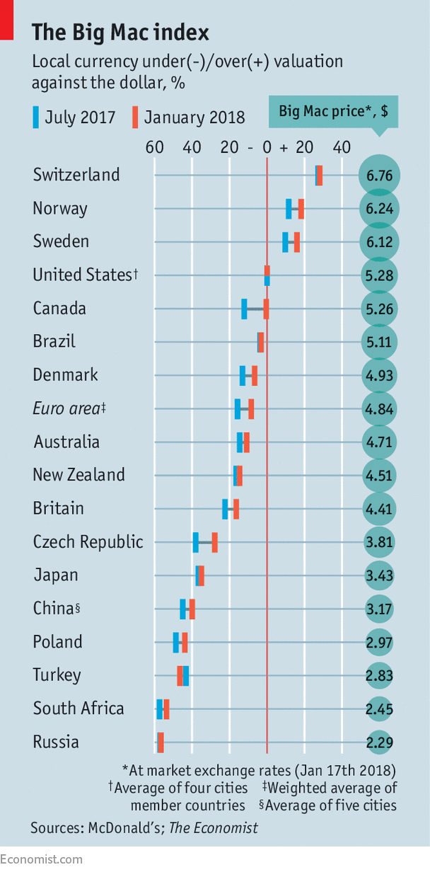
What works well:
- The overall look is neat and clean, ever bit of 'ink' has a purpose, be it as reference lines or labels
- Great consistent design that fits the Economist branding
- The title is simple but meaningful for many people, as they have probably previously heard of the Big Mac Index
- The subtitle provides an easy-to-understand description of how to read the chart
- The color legend is well placed and the speech bubble makes it clear what the numbers in the circles at the end of each row mean
- Sources are clearly stated
- Footnotes are included to clarify assumptions for specific countries or regions
What could be improved:
- While I like the footnotes, because they help me understand what different rows represent, they make the bottom of the chart look a bit busy, so I'd make the font smaller so a single or a maximum of two rows are required.
- The viz needs a bit more space between the elements, it is very compact and I think adding a bit more space would make it easier to read
- The smaller circles for the countries at the bottom of the list are almost too small for the labels. I'd reduce the font size for those countries or overall to ensure every label has enough space in each circle
- The horizontal gridlines for each country are a bit prominent. I'd lighten them. The darker lines between the two data points on each row are not necessary as they're not easy to see and are not really explained in the viz itself and the only record for which that difference is explained in the article, is the Eurozone
- The labels for the percent difference, while explained as % in the subtitle, are not as clear as they should be.
What I did:
- As I have never created an 'Economist design' viz, I wanted to use this week's data set to do one. And to incorporate the suggestions I made above to see whether it could be improved on (I do think the original is a really good viz!)
- I tried to get a very similar font, it's not quite the same but I'm ok with that.
- This was fun to create, I learned a few new things, such as using a very thin reference band instead of a line to ensure it is *behind* the marks rather than in front.
- Also thanks to Andy for helping me with a date calc
