Makeover Monday, week 30 2018: Maternity Leave
In the past few days I noticed a number of discussions on social media around maternity and parental leave in different countries and, more specifically, the lack of paid maternity leave in the US. So I chose a dataset that shows the number of weeks of maternity and parental leave available in different countries.Here is the original visualization from an OECD report: 
What works well:
- Countries are sorted by the weeks of maternity leave available
- Showing the payment rate for each country side by side with the duration is good for context, because it puts the actual duration in perspective
- Notes (not shown in the above image) in the report below the chart were very helpful for understanding the metrics
- Simple color palette
- Subtitle contains helpful descriptions
What could be improved:
- I find it confusing to see the avg duration for EU, Eurozone and OECD but not a payment rate to go with it on the right hand side
- The chart contains a lot of countries which makes it very busy. It would be helpful to have an interactive visualization with filter and search options
- What does the shading of some of the bars mean?
What I did:
- There are lots of different stories that can be told from this dataset so I chose to focus on a subset of the data
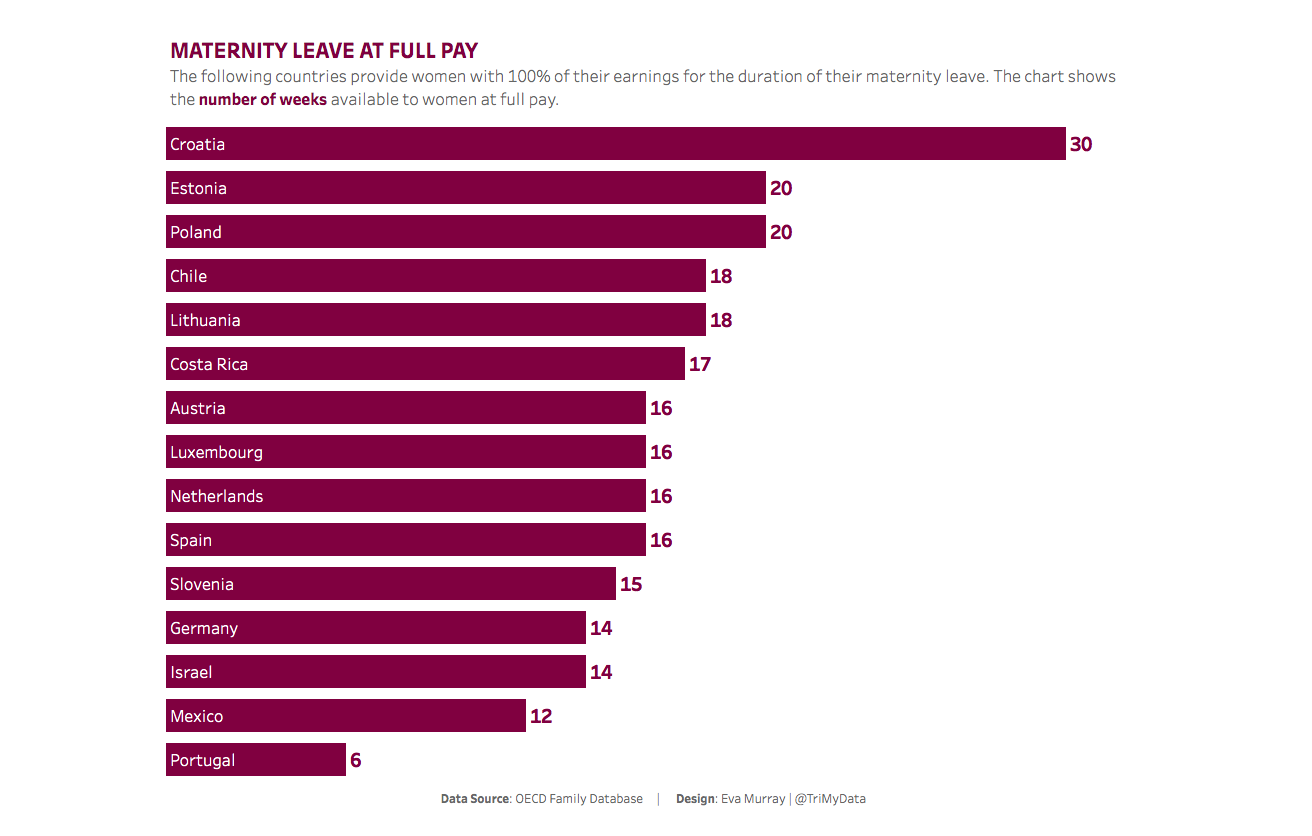
- While a number of countries offer significant amounts of maternity leave, a lot of them pay far below the full earnings during that time, so I decided to focus on those that do.
- I picked a simple color palette that works for the topic but isn't 'stereotypically pink'
- I decided to, once again, create everything in a single chart, using Andy's technique of putting the footer into the 'caption' so it all gets displayed in a single chart
