Makeover Monday week 23, 2018: The UK Gender Pay Gap

What a tough dataset Andy picked for this week. As much as I enjoy a good dig around the data, I do value my sleep and I'm missing out because I'm trying to make sense of this data.With a topic like the gender pay gap, it's not like I'm happy to just create some throw-away analysis and viz and be done with it.Here is the original viz: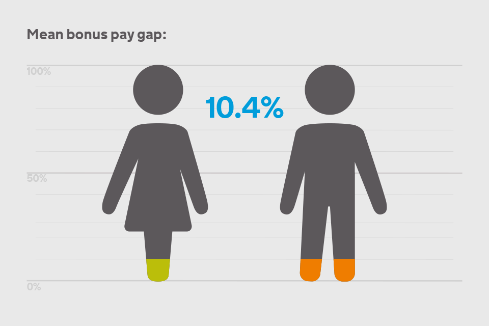
What works well:
- The icons for women and men are very obvious (and please no one get started about super hero capes now, let's just stick with the obvious), are well known and easily understood
- 0-100% are clearly marked, the icons fill up the entire range
- The icons fill up from the bottom
- There is a large number
What could be improved:
- The icons are irregular shapes, the man has two legs, the woman just one pair stuck together so it's difficult to compare the level of 'filled-upness' between the two
- Why make it difficult by using shapes instead of just a bar
- What does the number mean? Is it the percentage gap and in whose 'favour'?
- The heads of the icons are detached from their body, could there be data in between, around the 70% mark? If so, how will it be represented?
- What do the colors stand for?
- Maybe the icons are not filling up from the bottom and it's simply orange and green shoes they're wearing? Both colors go to roughly the same reference line, what does that mean?
- The line just below the woman's skirt, what number does it represent? It looks to not be the same distance as the others
What I did:
- I spent a few hours dragging, dropping, prepping, calculating, pivoting, getting frustrated, eating, getting back to it
- I created and deleted a bunch of charts that were all pretty pointless because there was always something missing that I wanted to use to find out more
- In the end I decided to forget about building a comprehensive story that would still have lots of gaps and instead opted for visualizing representation in pay groups across employee sizes
- Thanks Andy for your help with my aggregation checking and the labelling :-)
