Makeover Monday week 17, 2018: Ecological Footprint per Capita
After a week of malaria vizzes which had me very excited about the enthusiasm from the Makeover Monday community, we are turning our focus to Earth Day this week and the ecological footprint per capita for different countries.The original chart comes from the Footprint Network and looks like this: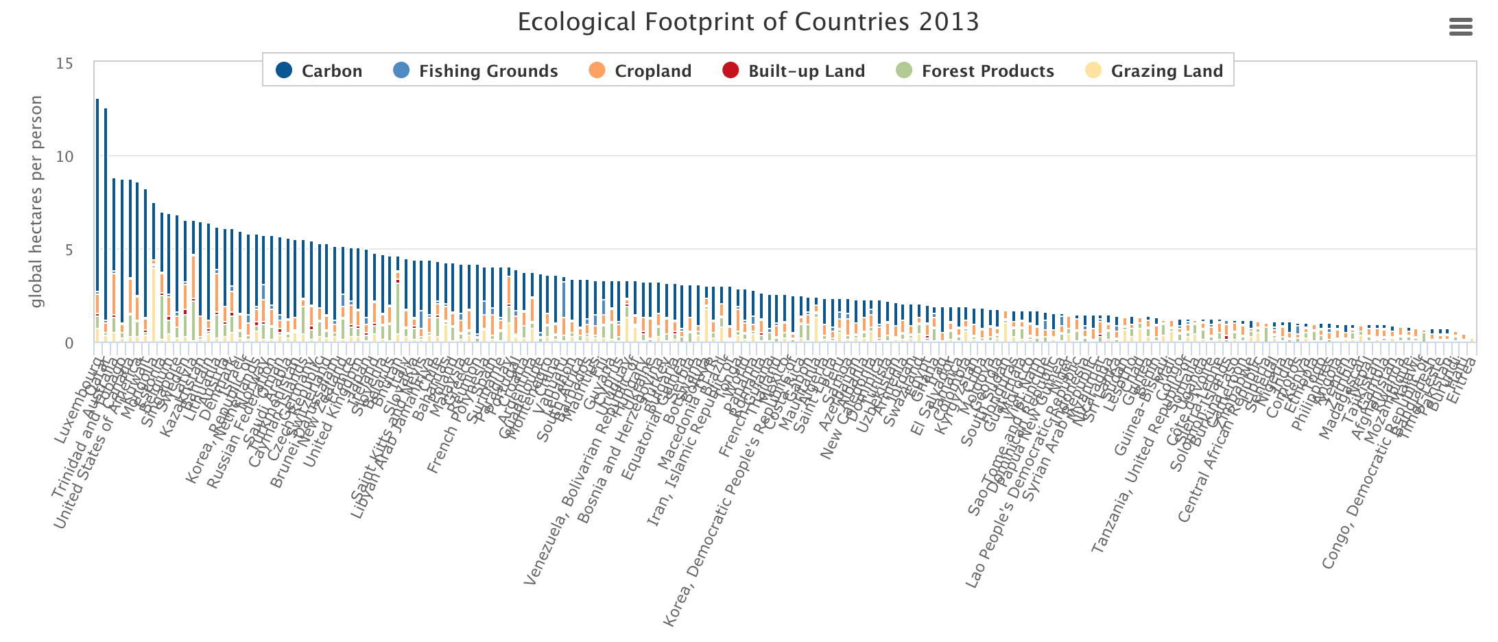
What works well:
- Sorting the countries from largest to smallest ecological footprint makes it easy for the audience to focus on those countries at the ends of the range, i.e. the ones with the biggest and the smallest ecological footprint
- Nice, responsive tooltips providing the detailed values for each metric
- Color legend is displayed prominently without getting in the way
What could be improved:
- Displaying all the countries at once results in an illegible mess of country names along the x-axis. If specific countries could be picked to be compared, that would allows for meaningful visual analysis without cluttering up the view
- The colors, while distinct from one another, are very hard to determine in the image
- The title is too small, it's almost not noticable
- The viz makes me think: so what? The values for each country don't really have a lot of context
- I can compare countries to one another, but of course every country is different with regard to its population (built-up land required), industries (carbon emissions), geographical location (what stuff grows there), so comparing them all without knowing which countries are similar in their make-up is pretty meaningless
- I would like to compare countries over time to each other and to themselves and their past ecological footprint. Are things getting better or worse? Which country is doing the right thing and what can the others learn from their example?
What I did:
- At first I spent a fair amount of time exploring the dataset, looking for trends, outliers and interesting data points. I thought I had found some only to realize the story vanished when I introduced different metrics rather than looking at overall carbon consumption for example.
- In the end I just ran out of time (because there's a book to write) so I settled for the easy way out and focused on Luxembourg which has a huge per capita carbon footprint compared to all other European countries.
Click on the image below for the interactive version