by Eva Murray | Mar 3, 2019 | Makeover Monday, Tableau
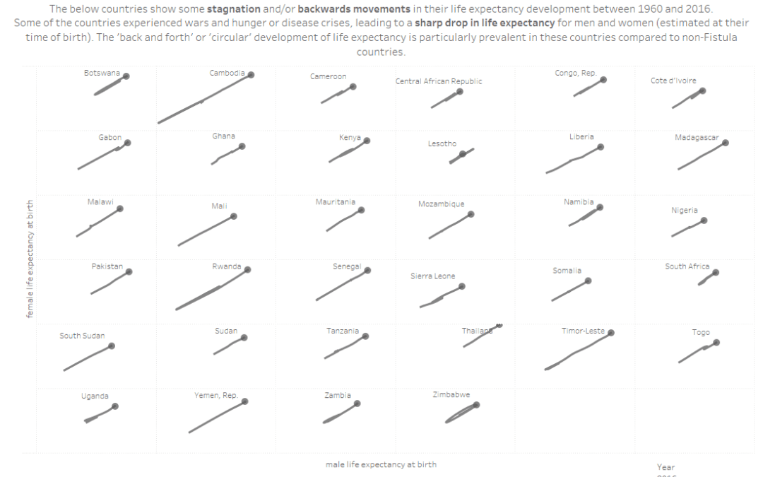
For week 10 we are collaborating with the team at Operation Fistula to support their mission and to bring more visibility and awareness to the issue of obstetric fistula (‘the worst thing you’ve never heard of’). The dataset is large in terms of...

by Eva Murray | Feb 25, 2019 | Makeover Monday, Tableau
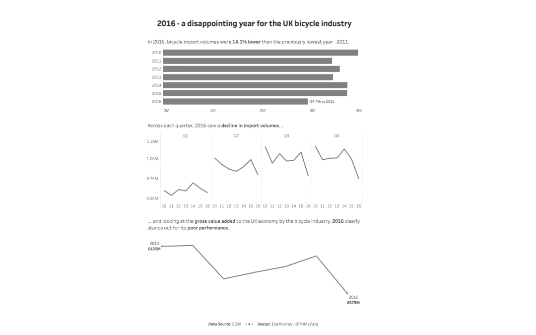
For this week’s MakeoverMonday challenge, we look at data about bicycle imports to the UK from 2010 – 2016. The original viz comes from a report by SQW and looks like this: What works well: Using a line chart for time series data Showing quarterly data...

by Eva Murray | Feb 17, 2019 | Makeover Monday, Tableau
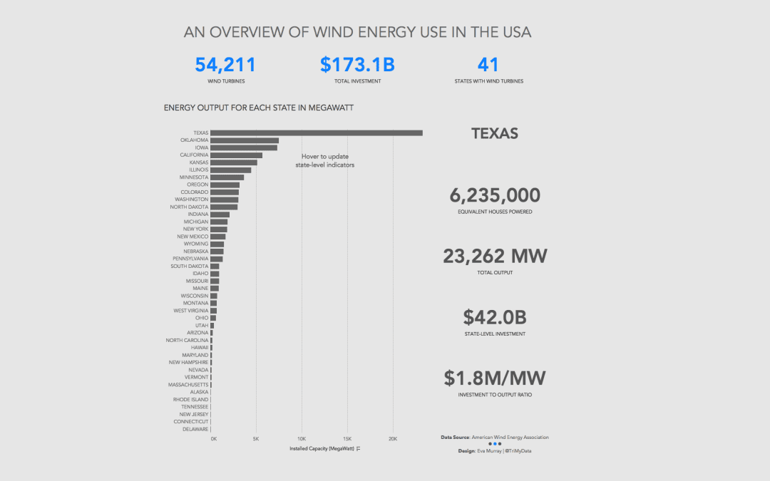
This week we look at how much wind energy is produced in different US states. The original viz (and awfully opinionated, anti-wind energy article) comes from howmuch.net: What works well: States are sorted in descending order from highest to lowest installed capacity...
by Eva Murray | Feb 10, 2019 | Tableau
The president of the United States is a never ending source of news and analysis-worthy headlines. The recent leak of Trump’s daily schedule provided us with a nice dataset to work with for Makeover Monday and there was no hesitation to use it for this...
by Eva Murray | Feb 3, 2019 | Tableau
One of the fun aspects of #MakeoverMonday is to pick a dataset each week. When I don’t have something obvious in mind or haven’t looked at the ‘backlog’ of options yet, I tend to check the calendar for significant events that we could viz...


