by Eva Murray | May 6, 2019 | Tableau
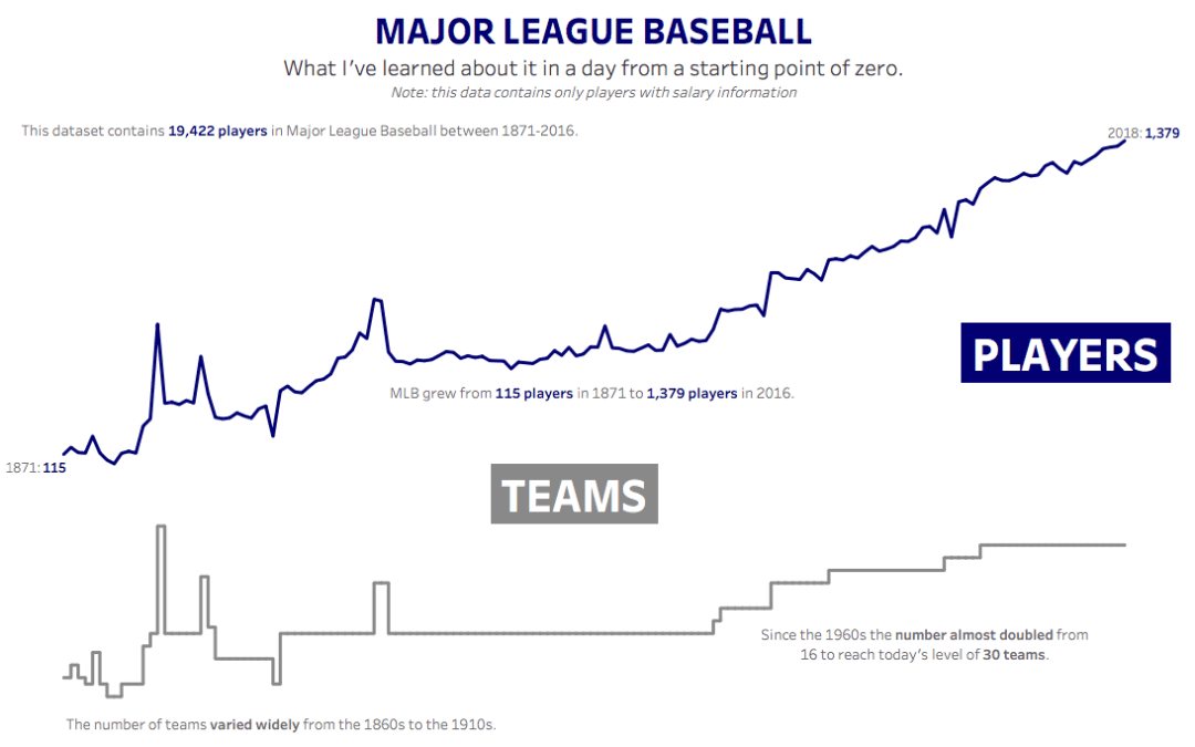
For week 19 Andy picked baseball data and I’ll be the first to admit that I expected it to not be fun, because it’s a topic I know nothing about and I wasn’t quite ready to spend hours learning about baseball. Until I did. Here is the original viz:...

by Eva Murray | Apr 30, 2019 | Makeover Monday, Tableau
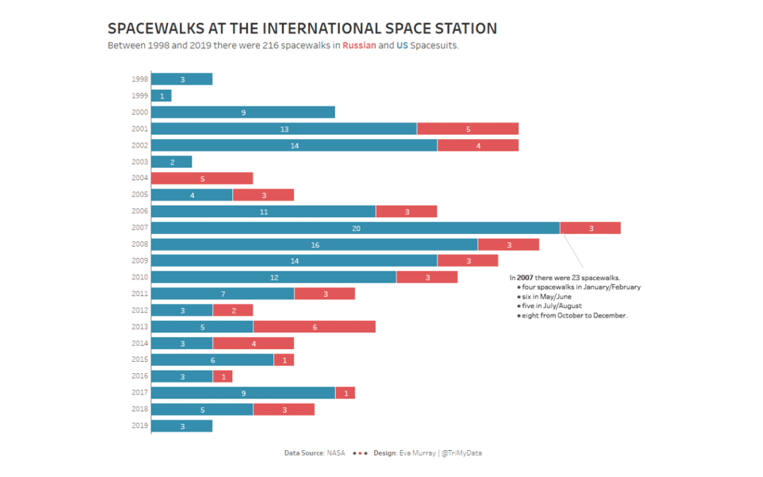
When I came across a dataset about spacewalks at the International Space Station, I knew I had to use it for Makeover Monday, especially because there were so many awesome vizzes from a previous NASA dataset about solar eclipses. Here is the original viz: What works...

by Eva Murray | Apr 22, 2019 | Tableau
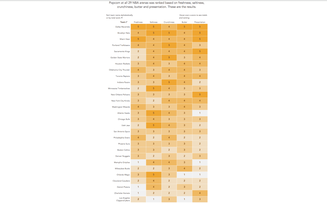
Andy found a great dataset for this week’s challenge: rankings of stadium popcorn at NBA stadiums across the US. It’s in an article by the New York Times and here is the viz itself: What works well: It’s a great viz of the ranking with clear labels...

by Eva Murray | Apr 15, 2019 | Makeover Monday, Tableau
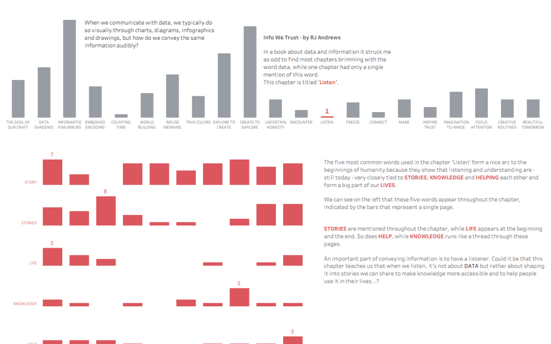
For this week’s makeover, we’re collaborating with RJ Andrews on his recent book ‘Info We Trust’. RJ gave me a fun word cloud and the data behind the 270 most common word-forms in the book. Something totally different from what we normally do,...
by Eva Murray | Apr 9, 2019 | Makeover Monday, Tableau
For this week’s Makeover, Andy picked a dataset that looks at the fiscal health of all 50 US states. The original visualization looks like this: What works well: The colors are well-chosen, take into consideration color vision impairments and work well together...
