by Eva Murray | Dec 22, 2019 | Makeover Monday, Tableau
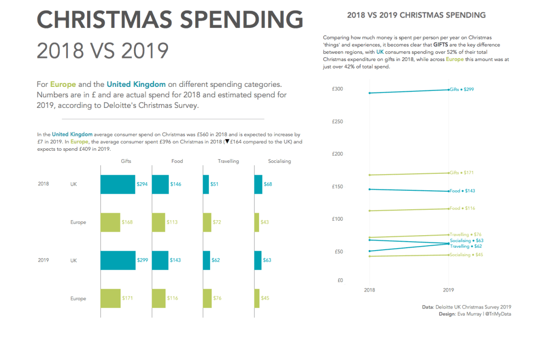
My last dataset for this year falls into Christmas week, so after a little convincing from Andy I set aside the data I had originally planned to use and picked a simple Christmas spending dataset from the Deloitte Christmas Survey 2019. Here is the original viz: What...

by Eva Murray | Dec 16, 2019 | Makeover Monday, Tableau
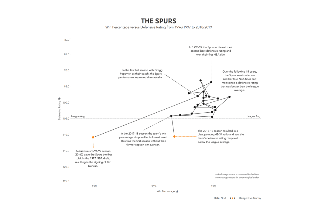
For this week, Andy chose a Basketball dataset. My expertise on that topic is limited to the claim of coming from the same town as the 6-time German champion team Brose Baskets. I went to see one of their games and all I remember is that it was really loud and fast...

by Eva Murray | Dec 9, 2019 | Tableau
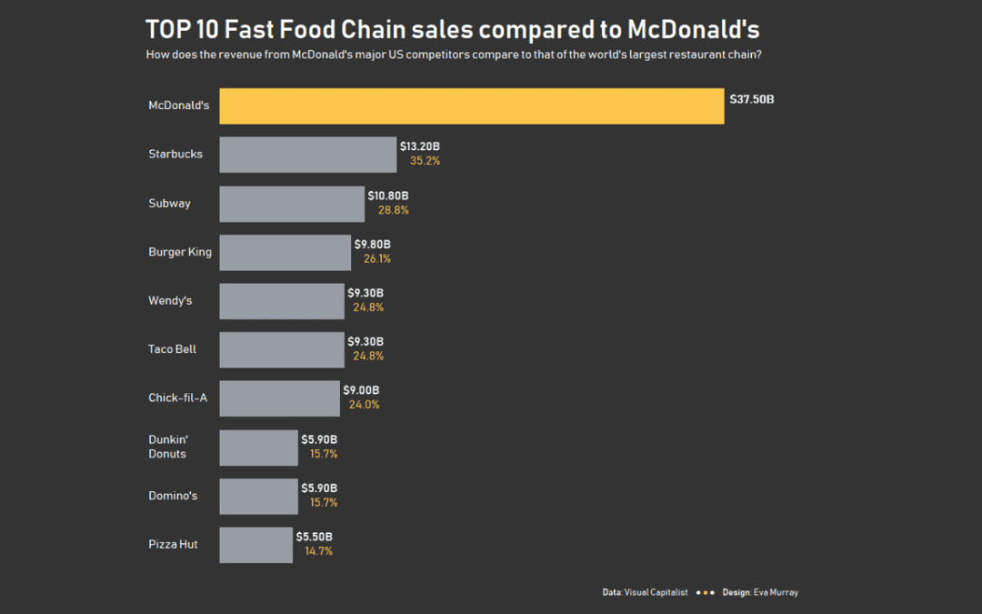
For week 50 of Makeover Monday in 2019, we’re analysing the revenue of America’s biggest fast food chains. Thanks to Andy for finding the viz and the data when all my search efforts resulted in terrible results. Here is the original viz from Visual...

by Eva Murray | Dec 2, 2019 | Makeover Monday, Tableau
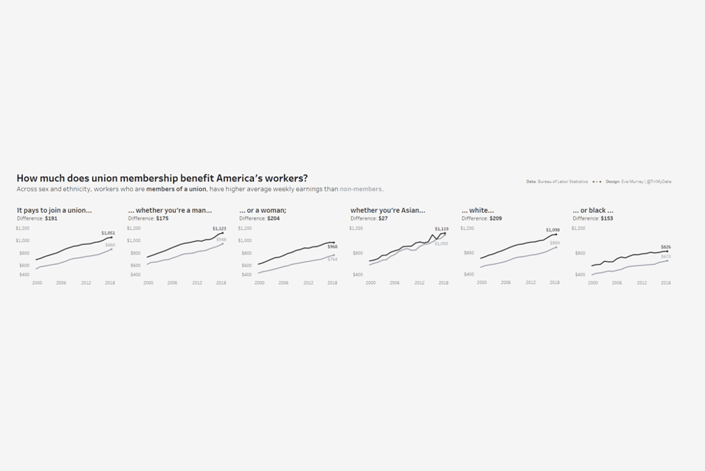
For week 49, Andy picked a dataset about union membership, from an article by Mona Chalabi, who writes for the Guardian and is a recognised journalist who uses data visualisation and data art to make information more accessible. I like Mona’s work and have read...

by Eva Murray | Nov 27, 2019 | Makeover Monday, Tableau
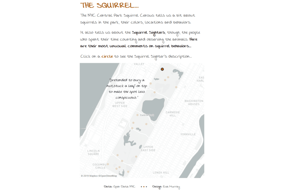
Since moving to London, squirrels have become my favourite sight. Maybe even my favourite animal. Horses dominated that rank for 34 years but squirrels are everywhere here, especially around the property where I live. And they are really cute, really fluffy and always...
