by Eva Murray | Apr 7, 2020 | Makeover Monday, Tableau
It is another week for a Viz5 dataset as part of our collaboration with Operation Fistula. This month, we’re looking at the topic of unpaid work, something so poignant right now that hundreds of millions of people are staying home and as such, unpaid work...

by Eva Murray | Mar 29, 2020 | Tableau
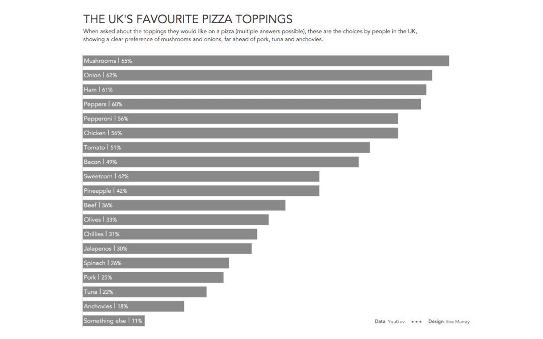
I’m pretty partial to food topics and this week Charlie chose an ‘excellent’ viz very much in need of a makeover, showing people’s favourite pizza toppings. The data behind it is nice and simple, so this week, rather than delaying my viz...

by Eva Murray | Mar 25, 2020 | Tableau
For this week I picked a visualisation that really stood out to me. It’s about the courses on offer at California University and looks like this: https://media.data.world/tI1lUfuRN2hybvZxHLwf_Field%20Distribution.png What works well: Not much, to be honest, but...

by Eva Murray | Mar 19, 2020 | Tableau
It’s been a crazy last few days and there is no point avoiding to talk about it. I would not be honest if I sais #MakeoverMonday is high on my priority list right now. As we all figure out the new situation around the world, working from home, taking care of...

by Eva Murray | Mar 10, 2020 | Makeover Monday, Tableau
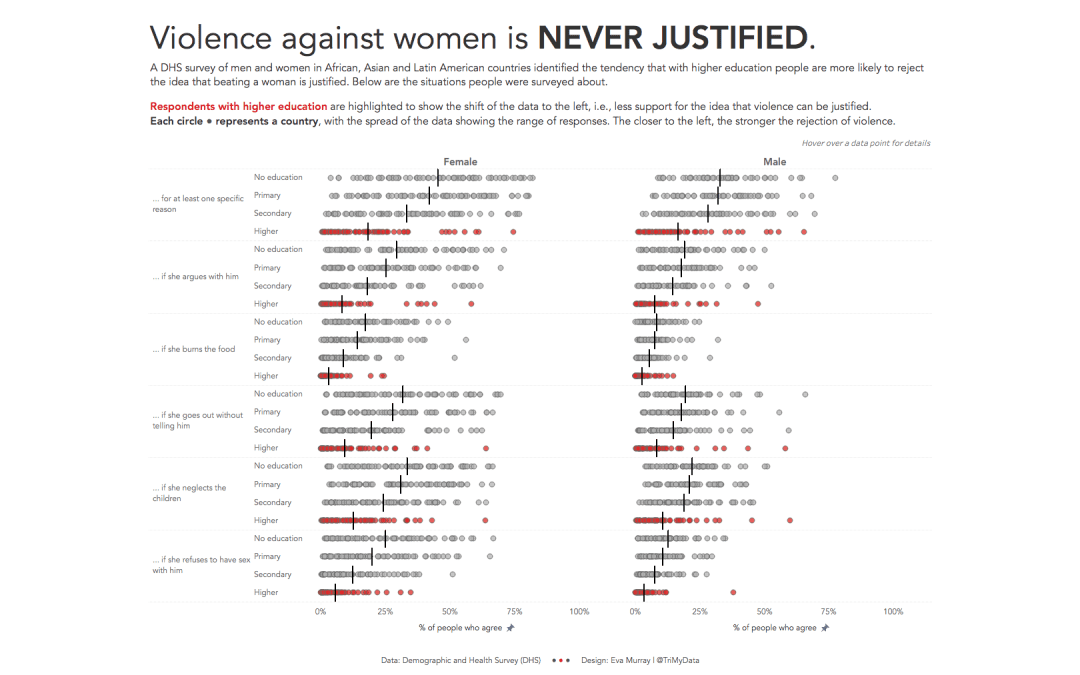
This week we launched the Visualize Gender Equality campaign #Viz5 and we are starting with a heavy topic: violence against women and girls and the perception of women and men towards violence being justified. I am excited about the year-long collaboration with...


