by Eva Murray | Dec 23, 2020 | Makeover Monday
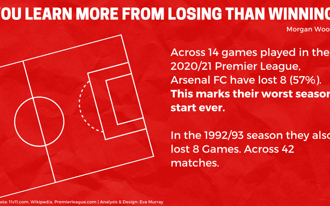
We are in week 51 of 2020 (it feels more like week 175…) and this week Charlie’s ‘parting gift’ is a dataset about the performance of Andy’s favorite team: Arsenal. Suffice to say they haven’t been exactly successful this season and...
by Eva Murray | Dec 15, 2020 | Makeover Monday, Tableau
Who doesn’t love Bob Ross? I imagine that most people who have seen him on TV have been mesmerized by his ability to capture beautiful landscapes with the dab and the brush stroke of his paint brushes with such apparent ease that made everyone feel like they...
by Eva Murray | Dec 9, 2020 | Makeover Monday, Tableau
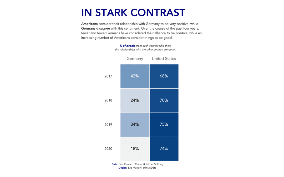
For this week Charlie picked an interesting topic: The perception among the population of how positive the relationship is between the US and Germany. The data came from a survey and the entire article can be found here. Here is the original visualization:...
by Eva Murray | Dec 2, 2020 | Makeover Monday, Tableau
This week is another #viz5 challenge and I love seeing everyone’s work come in all throughout the week. My vizzes for #Viz5 always take a bit longer because I want to get them right and today I got the chance to do my analysis while munching my lunch, and to...
by Eva Murray | Nov 25, 2020 | Makeover Monday, Tableau
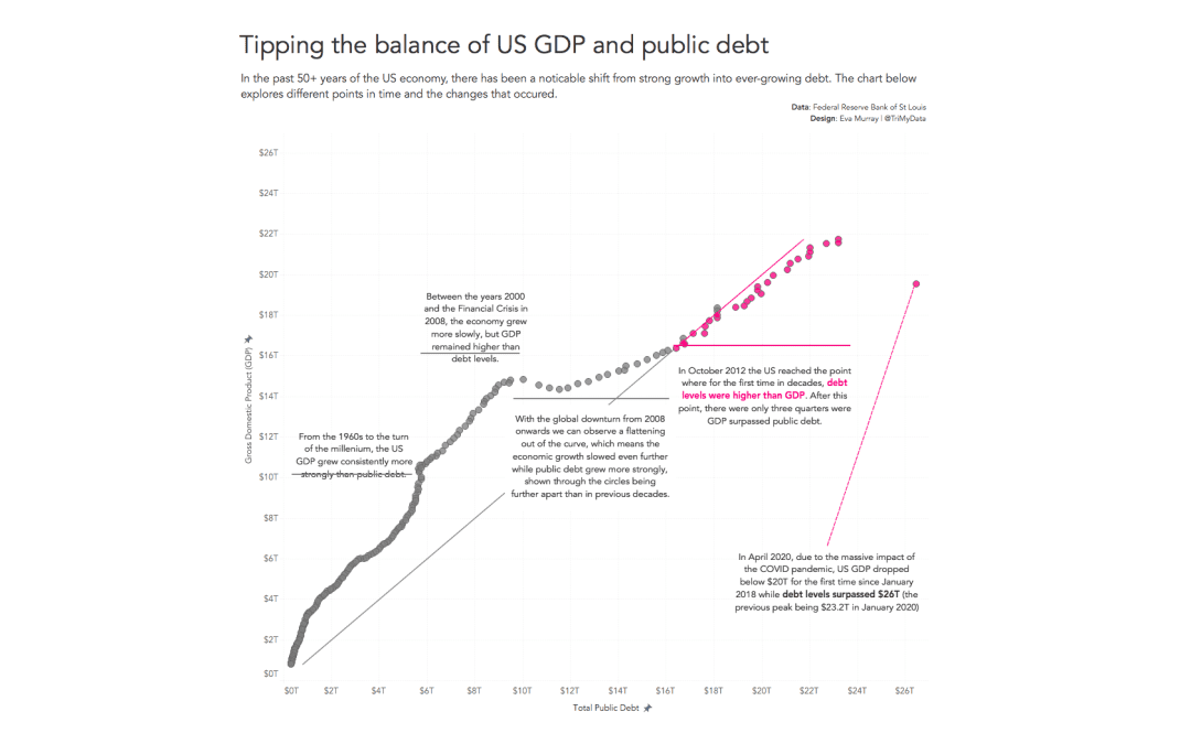
This week is, much like many recent weeks, a busy one for me with many commitments that mean MakeoverMonday had to be delayed by a couple of days. But here we are, ready to build a viz about the debt of the US. The original infographic Charlie chose for this exercise...