by Eva Murray | Mar 28, 2021 | Makeover Monday, Tableau
Quick one this week (and I’m skipping the usual assessment of the original viz because after 4 years, I’m sure everyone here knows the drill).Original: Source: https://www.theguardian.com/business/2021/mar/12/exports-to-eu-plunge-in-first-month-since-brexit-uk-economy...

by Eva Murray | Mar 21, 2021 | Uncategorized
I enjoy random topics like the one Andy picked for this week: What did 2020 look like for the cereal industry and what does the data suggest about our cereal consumption habits? (or at least those of people in the US?Here is the original visualization, published on...

by Eva Murray | Mar 14, 2021 | Uncategorized
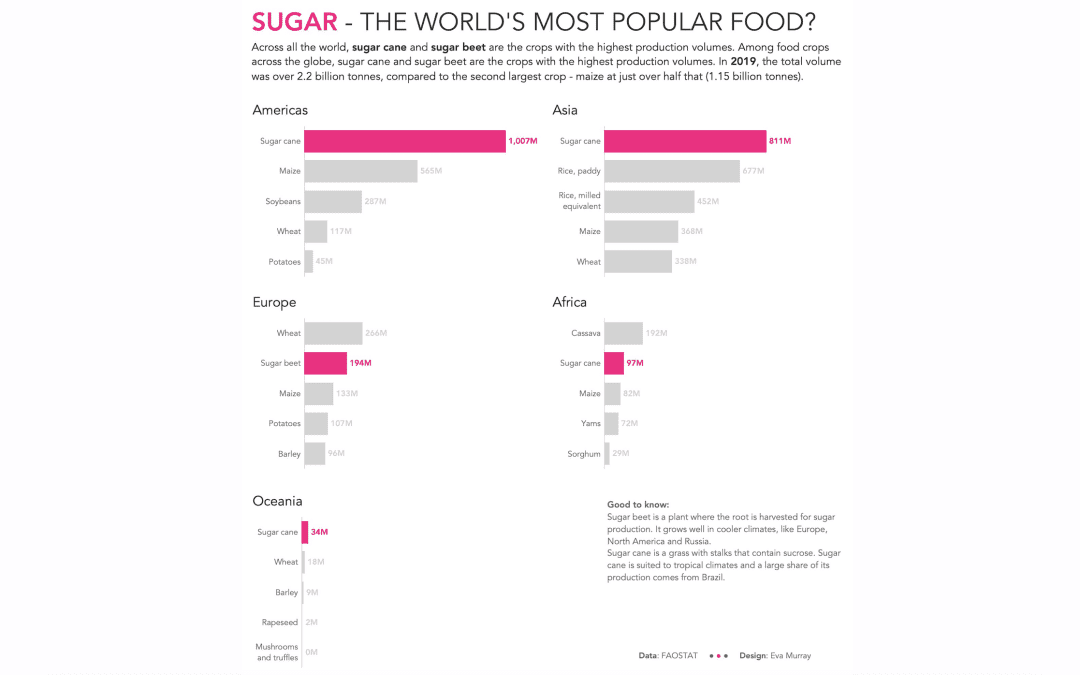
The visualizations we use for #MakeoverMonday are usually in need of a makeover but sometimes we use visuals that are already really good, and they cover an interesting topic or really good dataset.This week we’re looking at crops – what’s grown, how efficient...

by Eva Murray | Mar 10, 2021 | Makeover Monday, Tableau
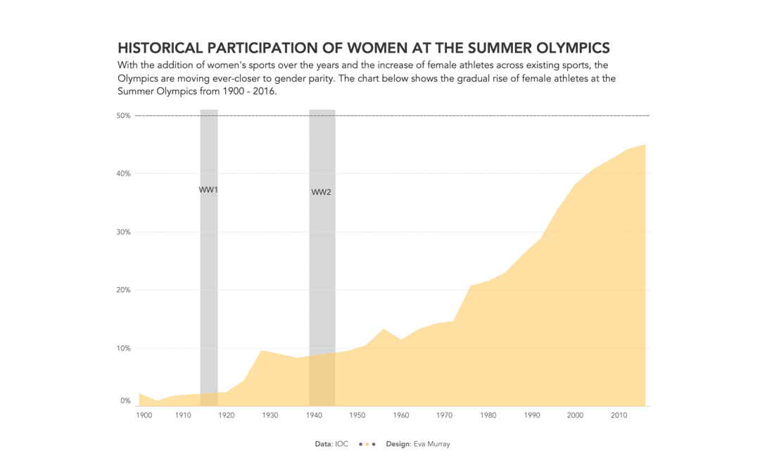
Continuing the theme of gender equality with a focus on topics about women and their situation as it relates to different aspects of life, society, politics, etc., this week’s focus is on participation in the Olympic Games.The original viz comes from swimswam.com and...

by Eva Murray | Feb 24, 2021 | Makeover Monday, Tableau
This week brings a challenging topic. One that requires all of us to slow down a bit rather than rush to work with the data. Topics that are polarising and/or taboo in society give us analysts an extra bit of responsibility treat the data carefully, check our...


