by Eva Murray | Sep 30, 2021 | Life stuff
This blog post is for everyone, but it’s especially for women. Our ability to bear children and the resulting impact on our careers, earning potential, on moving to part-time work or quitting the workforce altogether, means that we as women should pay particular...

by Eva Murray | Aug 22, 2021 | Uncategorized
The last 36 years have given me a life with many many ups and only a few bumps in the road. It’s been a great ride so far and long may it continue. Today I want to share all those life lessons that I have collected in the past three months since I met my dear friend...

by Eva Murray | Jun 1, 2021 | Life stuff, Makeover Monday
The story so farFor the last 4.5 years I have been co-leading the #MakeoverMonday project and helped to build it into the community it is today. Those years included work and effort from my side but everything I put in, I got 10-fold in return. #MakeoverMonday helped...

by Eva Murray | Apr 17, 2021 | Makeover Monday
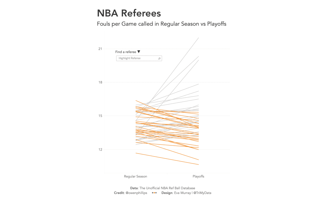
My viz for this week

by Eva Murray | Apr 7, 2021 | Uncategorized
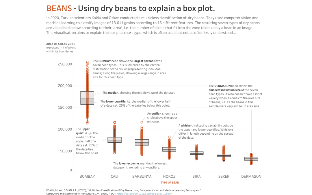
This week’s dataset is from a machine learning research project about classification of dry beans.Original viz: My makeover:


