Here we go again: sports data. It’s not that I don’t like sports. Actually, I love sports. I love participating, but not watching in front of the TV. When it comes to football (or soccer as some of you call it), there is really only one tournament I watch. The World Cup. All the other leagues and cups, I don’t even know how many there are right now… I don’t need that much football in my life to be honest.When I was younger I quite enjoyed watching the odd game of football, especially when I lived overseas and these games brought all the expats together in a pub at an ungodly hour in the morning.At the odd occasion when I do watch sports now, it’ll be on a Sunday, following an Ironman race for 8 hours while going about my day. It’s fascinating and exciting and so much can happen in those 8 hours. And no one falls over because someone touched their shoulder…Anyway, let’s stop the complaining and start this week’s Makeover Monday, which looks at the predictions versus real outcomes of the Premier League 2017-18 season. This viz and data comes from the Guardian.
What works well:
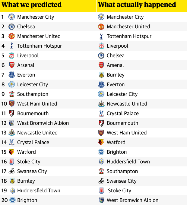
- The teams are sorted from best to worst into two columns: prediction versus reality
- Each team’s logo is included which probably helps those people who recognise the logo (i.e. those who, unlike me, follow the premier league)
- The column titles are easy to understand
- The rows are numbered
- The row banding helps guide the eye across from prediction to actual result
- It’s great to see the commentary in the accompanying article relating to their predictions. I didn’t read it all, though.
What could be improved:
- I’d suggest to swap the columns so the actual result is shown first, followed by the prediction
- Stoke City in the right column has an extra space in front
- The logos make it look very busy
What I did:
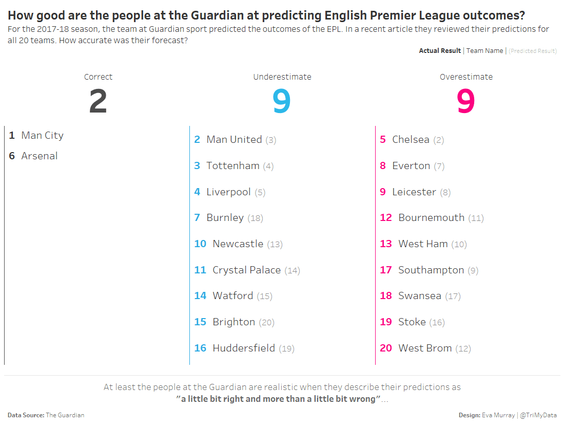
- There have been plenty of slope charts already and instead of looking at each team’s results, I wanted to focus on how good or bad the predictions are.
- I also enjoyed the pleasure of the 1 hour time limit which for me also included writing this blog, so I was forces to create something quick and simple
- I chose to highlight how many predictions were correct versus overestimates and underestimates and which teams they included
- The key improvement I see in this viz compared to the previous one is when it comes to understanding the quality of the predictions and seeing how many the Guardian got wrong. Sure, this isn’t a list ranking the teams in order, but its intended use is for assessing the predictions, not the team results


