This dataset found its way to me through some sponsored content on an Australian news website recently and I thought the topic was really interesting. At the same time, the dataset is easy to understand yet provides plenty of opportunity for different angles, visualizations and of course creativity.I’m writing this blog in Berlin, sitting indoors and listening to the rain which is finally cooling down the city after two scorching days of 30C temperatures. There will be a travel post or two coming up in the next few days, watch out for that.Now, let’s check out this week’s viz…
What works well:
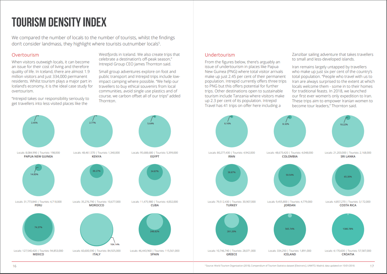
- Large visuals in bright colors easily engage the audience.
- I like that the text relating to the visualization is right above it, so you can look at these two pages and have all the information you need in one place
- The title is short and succinct, the subtitle briefly describes the data and provides an explanation of what the index is
- The colors work well together
- Adding the labels with exact number provides context
What could be improved:
- The colors don’t have a legend. What each color means can be understood when reading the numbers, but to avoid misinterpretation it would be best to spell it out clearly
- The surface area of the circles is very difficult to compare, so it makes it hard to see how many more tourists there are than locals or vice versa
- All circles are the same size, but the populations of tourists and locals differ for every country and so do the percentages. The scales are confusing here, e.g. Spain and Greece look very similar, but have hugely different numbers
What I did:
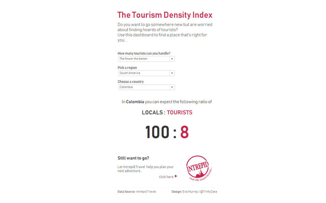
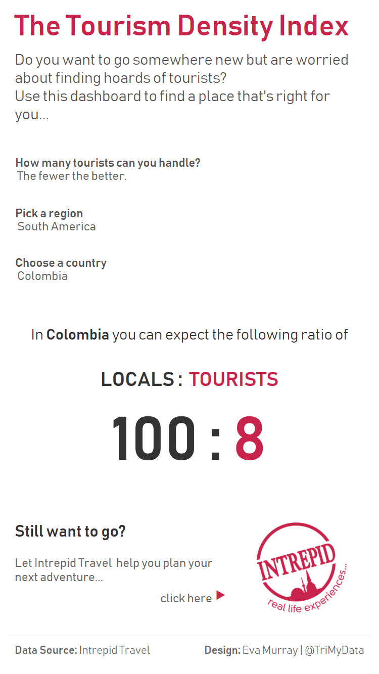
- I had the idea to create an app-like viz which lets users explore the tourism density for a given country
- Instead of using the percentage, which to me seems complicated to understand, I wanted a simple ratio, e.g. 1 local : 10 tourists
- Given the large numbers I had to make my baseline 100 locals and then create the comparison numbers in a very simple calculation
- The viz is mostly formatting, the actual data is just one single calculation


[…] the idea of ratio from Eva’s Blog and tried to show number of tourists per 100 local […]
How did you add the “100: ” to your ratio?
just download the workbook and find out :-). I’d have to do the same because the file is on my work laptop, but it’s getting late and I’m off to bed. Just download the viz from Tableau Public