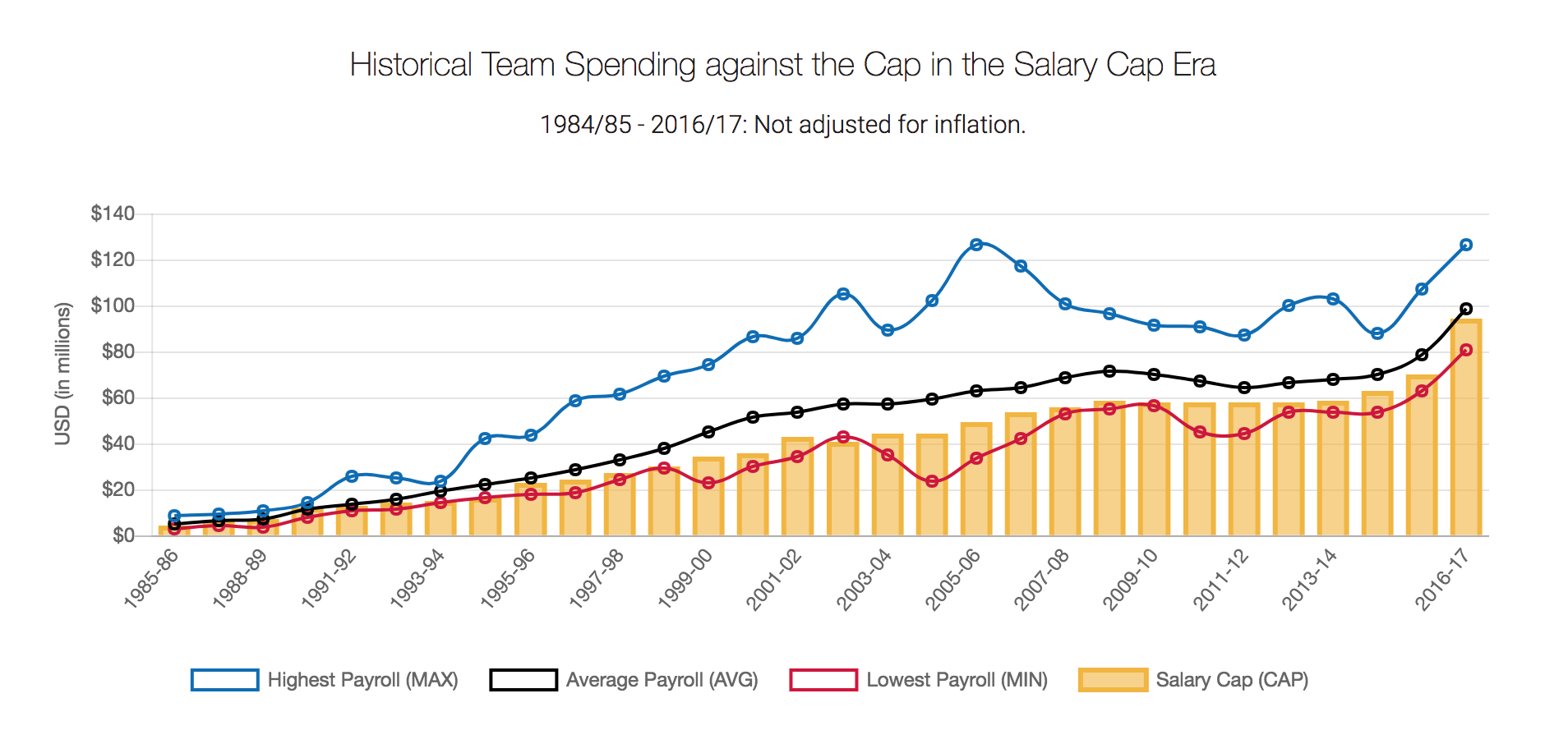
Andy actually did it: he pulled Basketball data on me! But hey, all good, we all have to occasionally work with data we know nothing about.The original viz comes from What’s the Cap? and shows a combined bar chart and line chart to indicate how high the salary cap in the NBA was for every season since the 1985/86 season and what teams actually spent.
What works well:
- Showing time series data with a line chart typically makes it easy to see trends
- Having the Cap shown as bars helps to differentiate it from the actual spend
- The colors are distinct
- The title is reasonably clear (as long as you know what the Cap is)
- Clear y-axis labeling
What could be improved:
- The color legend: Why show white boxes with colored outlines when the chart has lines and circles? A simple line or dot for each color would be sufficient
- What’s up with the massive overspending shown by the blue line? Annotations would be great to help understand who the team was and whether they were penalised for breaking the rules (a cap is there for a reason, right?)
- x-axis labels are only provided for every second year and are tilted so they’re not very easy to read. My eyes have to wander back and forth to figure out what belongs where
- The subtitle lists 1984-85 but that season isn’t shown in the chart
- Season labels are inconsistent: sometimes a dash is used, other times a slash
- Too much color overall
What I did:
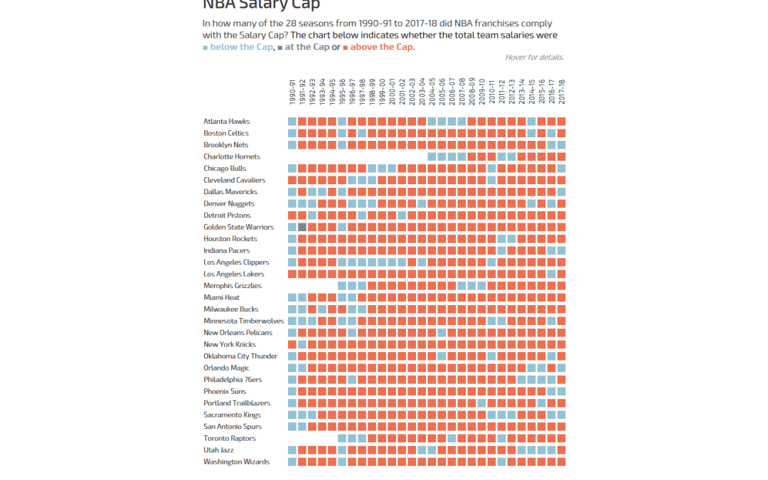
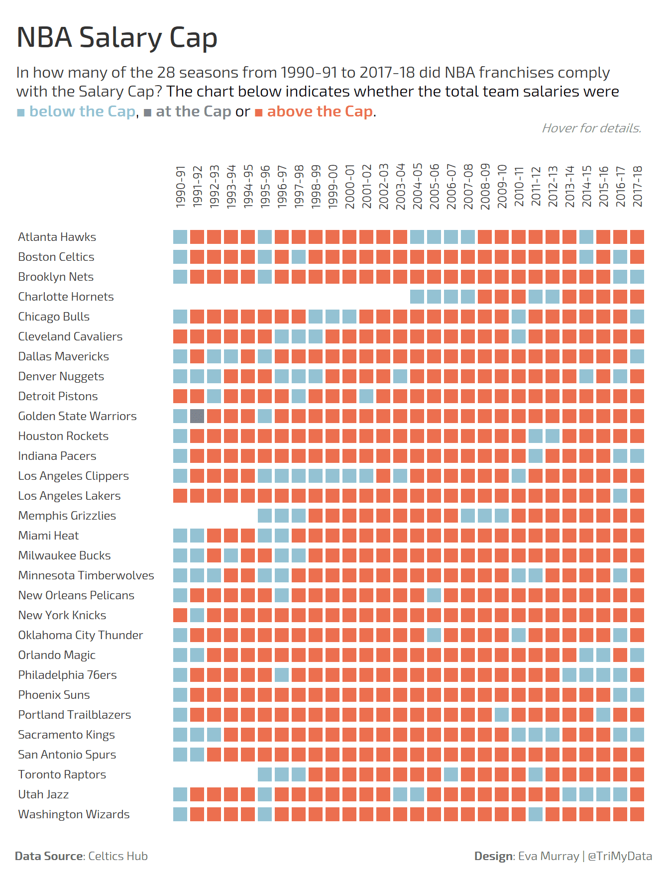
- A simple overview of the seasons when teams were paid above, below or at the level of the salary cap
- Everything in one single worksheet
- Used Andy’s calc for merging teams into franchises (who would have thought there even was such a thing)
- Customised the hell out of the tooltips – feeling smug and pleased with myself
- Tadaa


