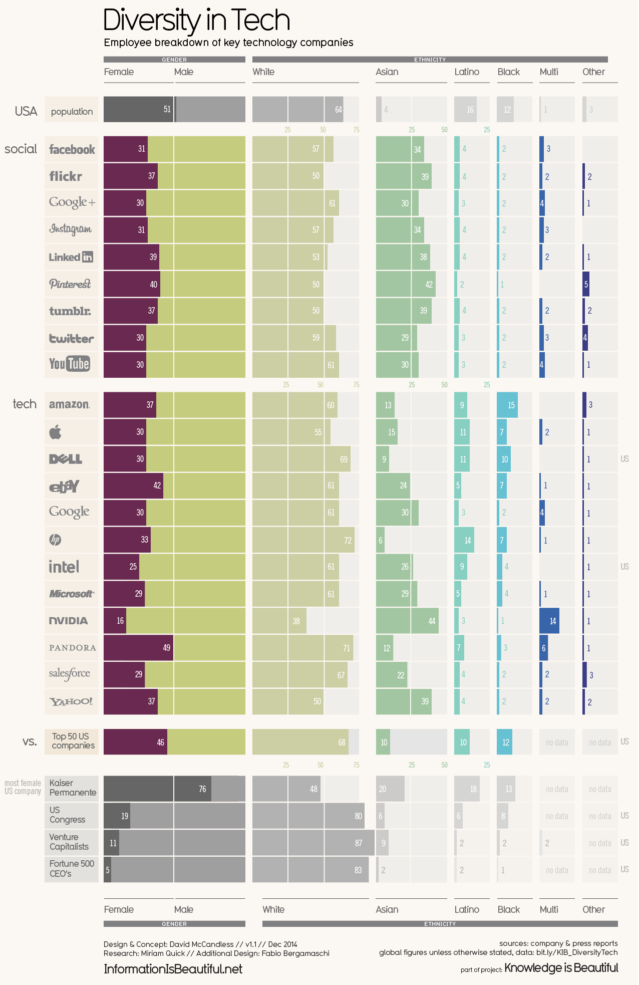
Diversity, particularly gender diversity, in business has been a hot topic for the past few years and is something we shouldn’t stop talking about until we’ve made some progress.This week’s Makeover Monday dataset looks at the makeup of workforce of different tech companies over time.The original viz comes from David McCandless:
What works well:
- Stunning visualization with excellent interactivity, filtering and sorting options.
- I really like the addition of comparison entities like the US Kongress, Venture Capitalists and Fortune 500 CEOs.
- The colors are well chosen and the labelling and division with reference lines is really helpful
- Sources and contributors are clearly listed
What could be improved:
- The color for ‘white’ is very similar to ‘male’, which can potentially be confusing
- Comparing over time is challenging because the year filter shows only one year at a time. So did these companies get closer to a gender balance over time? What has changed? These questions cannot easily be answered
What I did:
- I limited myself (somewhat) to an hour, by deciding to make this a quick MM in favor of spending time with my family and baking Christmas cookies with mum
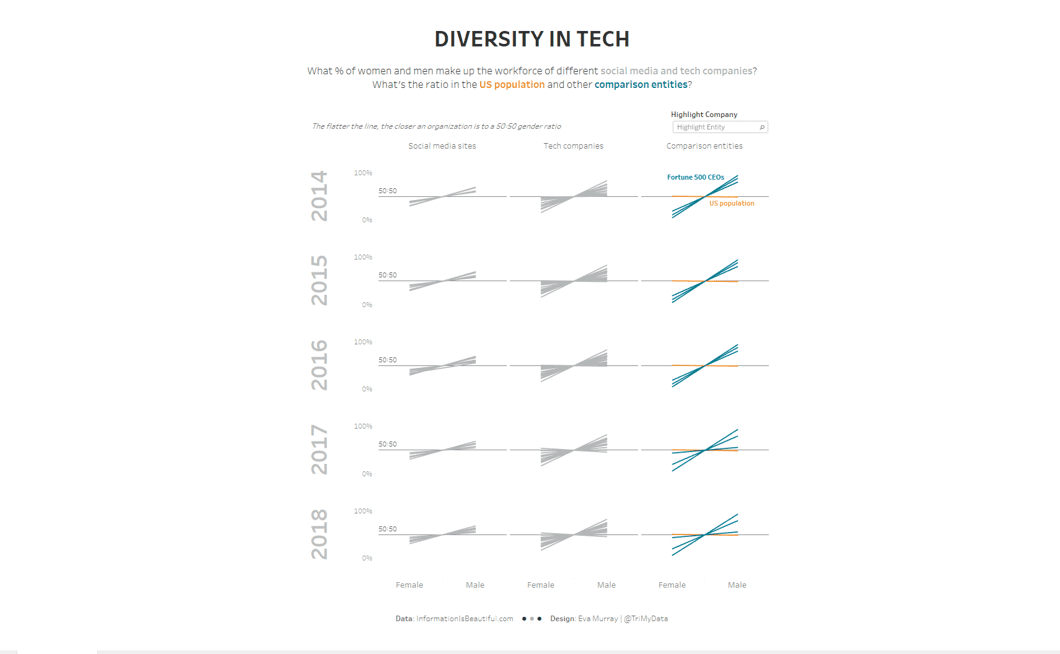
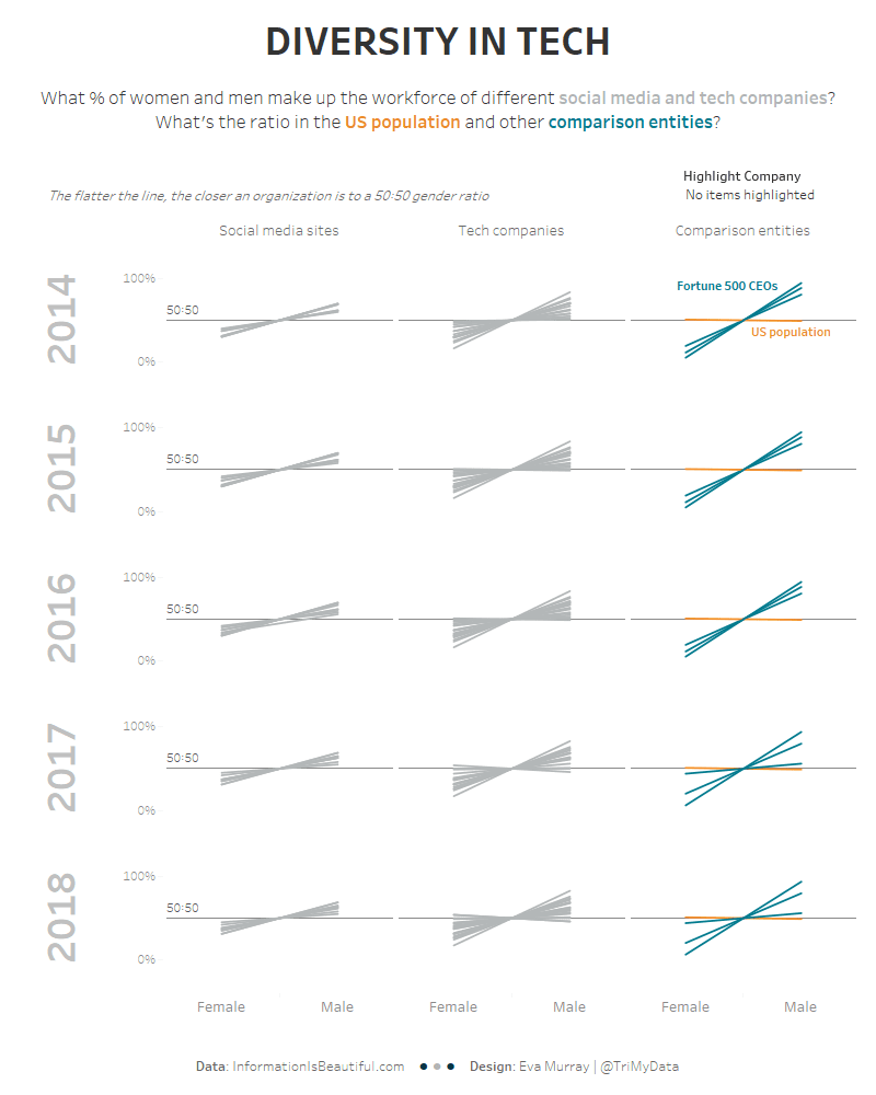
- To compare female vs male workforce I found a slope chart to work pretty well
- I added a highlighter to my dashboard in case people wanted to find specific companies among the many lines.
- I decided to show the overall picture rather than providing all the detail for every company. While this results in a viz that isn’t as informative on the individual company level, as it could be, it shows the overall state of business: the slope going up to the right shows that basically every company has a substantial amount more men in their workforce than women
Click on the image below for an interactive version


