For week 19 Andy picked baseball data and I’ll be the first to admit that I expected it to not be fun, because it’s a topic I know nothing about and I wasn’t quite ready to spend hours learning about baseball. Until I did.
Here is the original viz:

What works well:
- It’s eye catching
- Nice color choices
- Neat design
- Provides a fair amount of information in a concise space
- Title tells me what it’s about
What could be improved:
- As a non-baseball-person I can’t understand much of it without further context
- Why are the stats highlighted below each viz different to those highlighted in the viz?
- Which players and teams get diamonds in the viz and which don’t?
- Including the author and data source in the viz itself would be good
What I did:
- I played with the data for a bit and thought I had found something interesting when looking at growth of player numbers versus the total players per team per season. It indicated that trades were becoming more common.
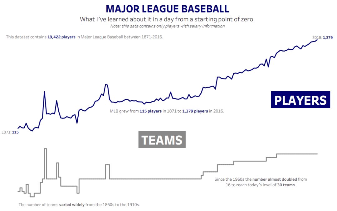
- That was my starting point and after many baseball questions to Andy I decided to visualize what I learned about baseball in a day,
- And you know what? It was fascinating to explore the data, read up on Wikipedia in parallel, build calculations, fix them, fix them again and create this dashboard over the course of six hours on Sunday afternoon and evening.
- So here is my viz. Thanks Andy for patiently answering all my questions 🙂


