Somewhere in the middle of season 6 I stopped watching Game of Thrones and I never actually went back to it. I have to say I don’t miss it but I do understand why people are hooked to the series.
This week for Makeover Monday we’re looking at deaths in GOT and there are MANY of them.
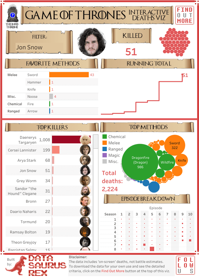
David Murphy, fellow Zen Master and actually my very first Tableau friend whom I met at a TUG in Sydney all the way back in 2013, didn’t just create a dashboard about GOT deaths but also collected all the data himself. That’s some serious dedication!
Here is his viz which he has kindly offered for this week’s challenge:
What works well:
- I love the amount of information on this dashboard.
- The banners are designed in line with GOT design and having character’s faces on the dashboard makes it instantly recognisable for the audience.
- The disclaimer is really helpful.
What could be improved:
- While I love the amount of information, I feel it’s too much for the space available.
- There are too many colors, the dashboard looks very busy.
- The Top Killers should have a dashboard action to be selectable as a filter.
- I’m missing a proper horizontal axis for the running total. While I can guess it’s across all seasons, I can’t tell for sure from looking at it.
- The design could be more consistent overall. Instead of having the datasaurus rex pink everywhere, why not make it much moodier to match the topic?
What I did:
- The dataset is absolutely amazing and there is a huge amount of potential in there. With my move to another city in another country just 3 weeks away, I have to limit myself to not spending too much time on MM at the moment, unfortunately. There are so many things to get ready for the move that demand my attention.
- So I explored the data and built half a dozen charts to get my head around the different dimensions available.
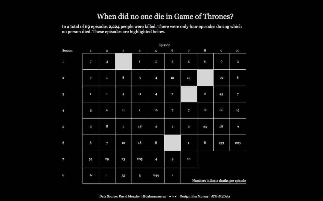
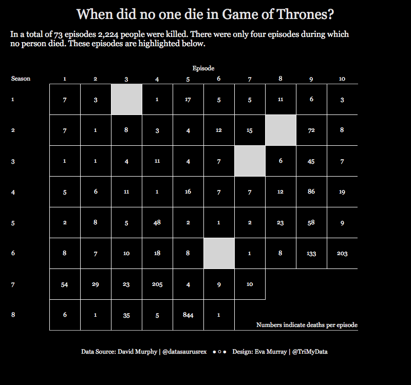
- In the end I settled on showing when no one died. Because that’s a rare occurrence actually.
- Here is my viz about the episodes when no one died in Game of Thrones.


