For week 33, Andy chose a fascinating dataset and topic which we were made aware of by Steve Wexler.
Clinical trials for medical drugs are an interesting topic and one which I came across recently, but in the context of gender equality. At this point I want to strongly encourage anyone who has a wife, daughter, sister, girlfriend, niece, aunt, grandma or mother to pick up a copy of ‘Invisible Women’ (it’s a book about data) and settle in for a dose of much-needed reality check.
This week we’re looking at a viz and data collected by Spencer Philips Hey, who brought together years worth of data about clinical trials and all their published details.
The viz looks like this:

What works well:
- I LOVE the amount of detail that is contained in the viz. It’s a treasure trove of information for anyone keen to dig in.
- The viz contains a number of dimensions which have all been represented through the different shapes, sizes, colors and positions on the chart.
- The data is sorted by disease and chronologically, helping us to understand patterns and trends over time.
- Dominant pharma companies as well as highly-researched disease become apparent very quickly.
What could be improved:
- I cannot find a legend, so have to hover over different dots to find out what colors and shapes mean. They are explained in the article but it would really help to have this information right by the viz.
- The vertical space given to the viz means that most shapes overlap into other diseases and years. and they are clustered together and overlap one another. Hovering over without having the ‘selected’ shape highlighted means that the information in the tooltip cannot be clearly linked to a shape. I can see the details but I don’t know what shape they belong to.
- It’s a very busy viz overall and I am reluctant to really interact with it, because I cannot filter to a specific company, disease or other category. It’s all or nothing and I’m feeling overwhelmed. Which is such a shame because the topic is super fascinating.
What I did:
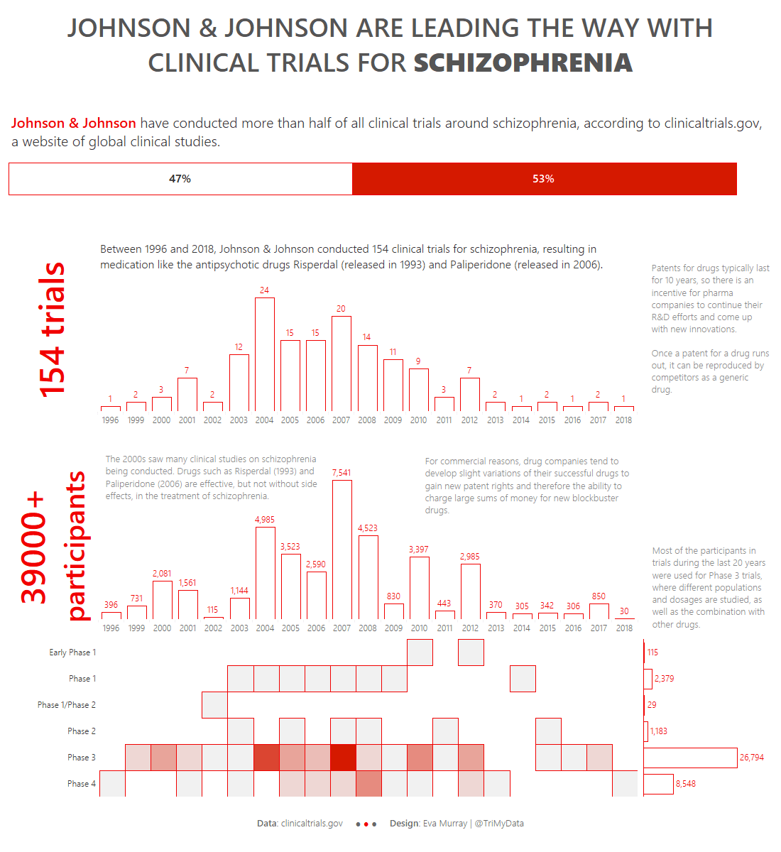
- Looking at the data, there is an overwhelming amount of information in it, so I picked a single condition: schizophrenia.
- I then looked at the data by pharma company (trial sponsor) and came across Johnson & Johnson’s dominance when it comes to schizophrenia (antipsychotic) drugs.
- So I built the following dashboard. I have to say, I don’t love it. I don’t even particularly like it. I would like to have more time to research and investigate and actually put together a compelling story rather than just a bit of information. But for this week, it’ll have to be enough. It’ll just have to be a dataviz exercise more than anything else.


