Given the buzz of #data19 last week, we’re working with a small and simple dataset for week 47, so we can all have some extra time to catch up on the things we missed at home.
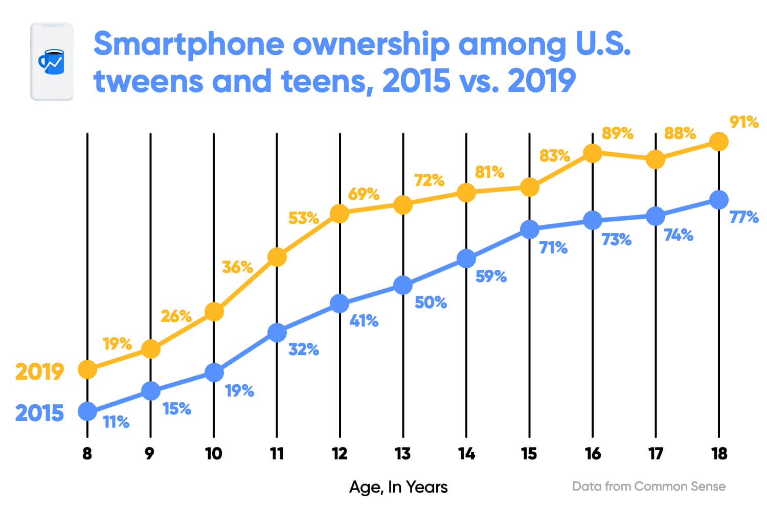
Here is the original viz:

What works well:
- The colors draw my attention.
- The line chart nicely shows the progression to higher levels of smartphone ownership over time and with increasing age.
- The age axis is clearly labeled.
- The title is clear and simple
What could be improved:
- The gridlines are quite prominent and distract from the actual data.
- The title is the same color as the 2015 line, but doesn’t relate just to 2015, this is a bit confusing.
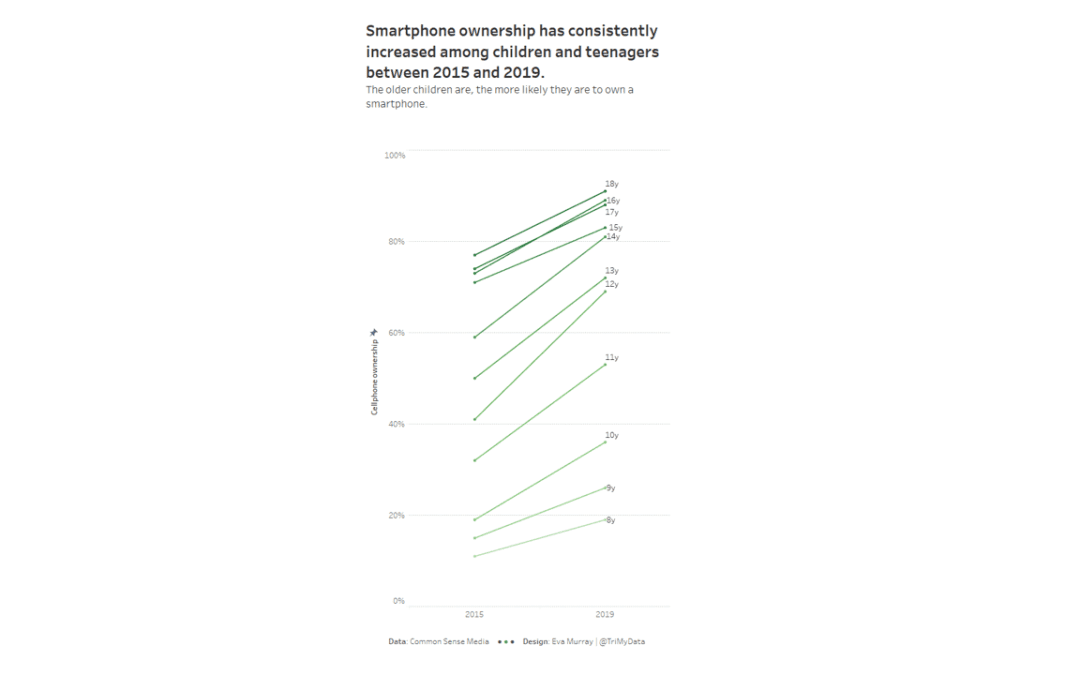
What I did:
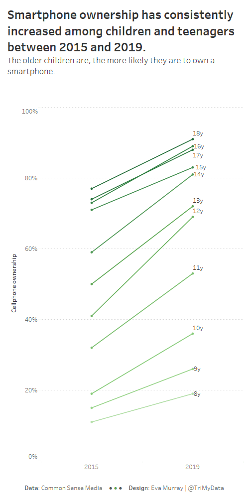
- I needed something quick and simple so I settled for a slope chart.
- I was keen on a heatmap, but we only have 2 years for comparison, so it wouldn’t work very well.
- I decided to add color for ages to show that smartphone ownership didn’t just grow over time but also with age.
- Click the image for the interactive version.


