Since moving to London, squirrels have become my favourite sight. Maybe even my favourite animal. Horses dominated that rank for 34 years but squirrels are everywhere here, especially around the property where I live. And they are really cute, really fluffy and always busy. Plus, they put a smile on my face when they bounce around the lawns, hedges, fences and trees.
So when I came across this dataset about squirrels in New York’s Central Park, I just had to use it for Makeover Monday (admittedly in the hopes of a repeat of my favourite dataset so far: the migration patterns of turkey vultures in the Americas).
So here is the original viz:

What works well:
- Great tooltips (when they work)
- Easy zoom-in and zoom-out
- Most people will know how to interact with a map
What could be improved:
- There is no color legend, which is ironic given that this is a map about squirrel fur colors
- No indication of what each dot represents: some dots are 1 squirrel, some are multiples
- The dimension of time is not conveyed through the map. It seems to just be all of the squirrels sighted across the year. But I’d love to know if they spend more time in a certain area during certain seasons, for example
- No call to action or takeaway-message. What am I supposed to do with the information?
What I did:
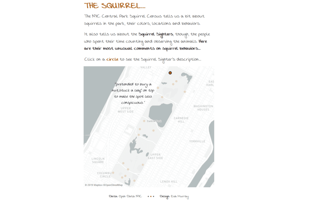
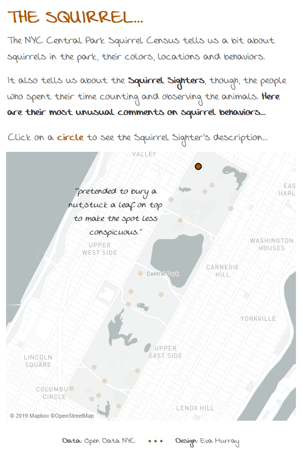
- Yes, I included a map, but rather than showing stuff about squirrels, I found it more interesting to look at the sometimes peculiar, sometimes hilarious description from the observers (the Squirrel Sighters) when documenting squirrel behavious.
- I also focused on only selected activities, the ones with the funniest descriptions. They make me think about people sitting in Central Park, watching squirrels and capturing their observations while also injecting a bit of their own personality into the data.
- I went for a hand-writing font to go with the theme of casually watching squirrels and taking notes.
- Check out the interactive version here or by clicking on the picture


