This week we’re looking at the World Happiness Report 2020, which lists over 150 countries in order of their reported happiness, based on a survey conducted by Gallup.
This is the viz:
What works well:
- Ranking from most happy to least happy country
- Total score is listed behind each country for context
- I love the gridlines in the chart
- Color legend is okay too
What could be improved:
- The colors are not great at all, the combination is strange, especially with the fluorescent yellow and the strange pastel purple. Not appealing at all.
- There are no insights listed on the viz itself and the different metrics are not explained. As the report is rather lengthy (140+ pages), having the image by itself means it can be misunderstood.
- The chart title is not very descriptive, it would be helpful to have a short subtitle included.
What I did:
- I’ve been very stretched for time lately, so a super simple viz has to suffice for this topic.
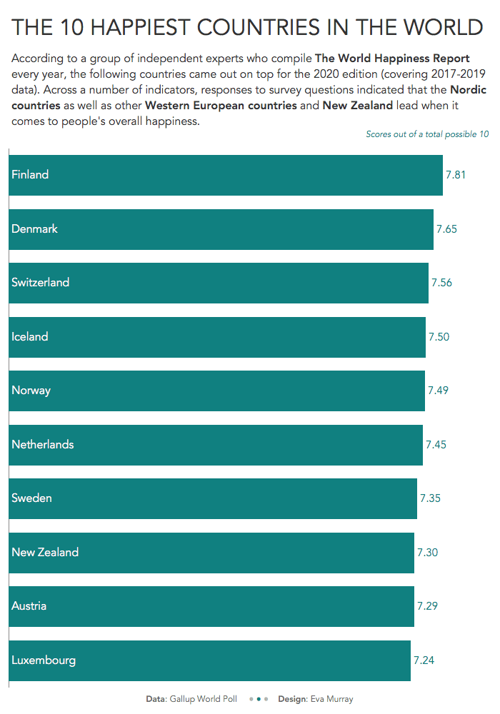
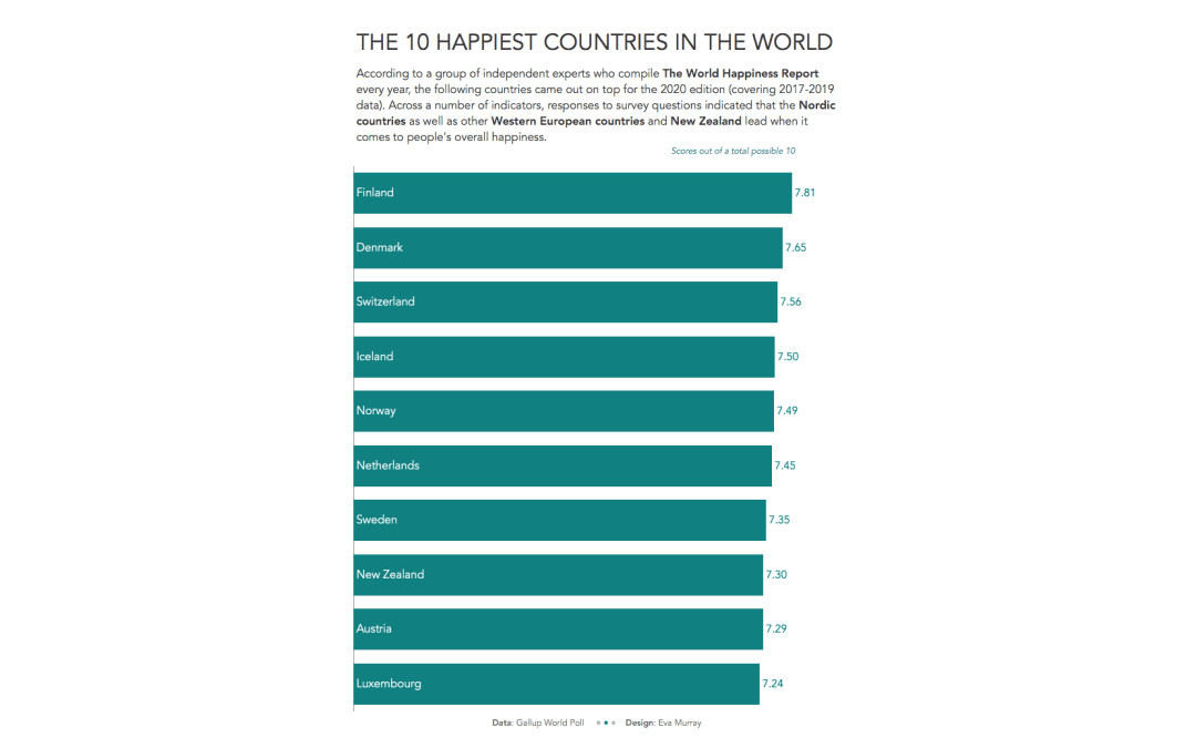
- It’s a bar chart of the top 10 countries, the 10 happiest countries in the world.
- Here it is:


