Sometimes I stumble across dataviz gems with topics that make me smile. This is one of those weeks with the topic being the flipper and bill length of different types of penguins in Antarctica.
The original viz and fantastic data prep work + art work comes from Allison Horst and looks like this:
What works well:
- The colours are fun and easy to distinguish.
- A scatterplot is a great choice for comparing 2 continuous measures.
- The title and subtitle are short and informative and make me want to know more about the subject.
- The colour legend is nice and prominent, using some of the blank space in the chart.
What could be improved:
- I’m a big fan of adding your findings somewhere ‘in the viz’, i.e. in the subtitle or title or annotations so that the image stands on its own and can inform readers/viewers without the need for an additional article.
- The gridlines are pretty prominent and making them more subtle could help me focus more on the data points.
- I’m not a huge fan of using different shapes in addition to different colours, as they add further complexity.
What I did:
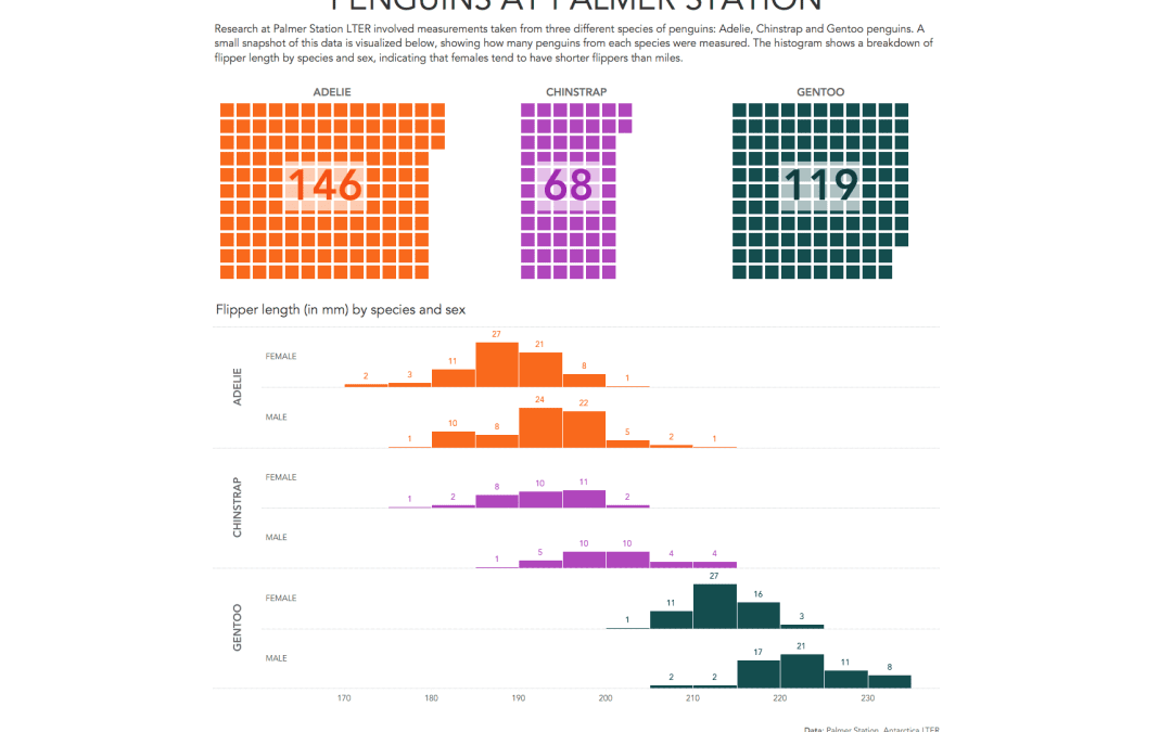
- It seems to be typical for me that when there is lots of detail available, such as size of calmer and weight of the penguin, the date of their egg, their location, etc., I revert back to a few simple questions like: how many penguins were there? Maybe it has to do with my desire to understand the context first before going further.
- Anyhow, here is my viz for this week:


